Photography got its start in the Black and White domain, and it continues today as an important movement in the art. It is often highly regarded, commanding a greater deal of respect than color photography.

News, Muse and Reviews for Aspiring Lensmen.
Showing posts with label Tutorials. Show all posts
Showing posts with label Tutorials. Show all posts
Friday, August 23, 2013


Wednesday, August 21, 2013
Dodging and Burning
This is a traditional darkroom technique used to selectively lighten and darken areas of a photograph during the enlarging process. A mask in the shape of the area to be lightened is attached to a thin wire and held in position just above the photo paper in the enlarger, so that it shadow prevents exposure. Slight movement softens the edge and prevents the wire from adversely affecting the expsoure. This is known as “dodging”. Burning is the opposite effect, in which the area to be darkened is cut out of a larger paper mask to prevent exposure to other areas.
In digital retouching we use this effect on a daily basis to control local contrast so as to extend the apparent dynamic range of the photo. It’s a relatively simple process of selecting part of the image and applying an adjustment to alter its luminosity value. However for finer control, we can create adjustment layers that we can use to “brush in” the effect.
The many adjustment tools and blend modes in Photoshop can be used in many combinations to achieve advanced effects. For this tutorial however, we are going to concentrate on three techniques using The Overlay, Multiply and Screen modes.
Creating a Dodge & Burn Layer
For subtle adjustments, nondestructive dodging and burning can be performed in a single layer. For a more pronounced effect and to gain more control over color, we can use a separate layer each for dodging and burning as explained below.
1. From the menu bar, select Layer > New > Layer… or press Command + Shift + N.
2. In New Layer dialog, select Overlay from the mode menu and check the “Fill with Overlay-neutral color (50% gray)” box. Rename this layer “Dodge & Burn” if desired. Click OK.
3. Press D to set the background colors to their default black and white.
4. Press B to switch to the Brush tool.
5. In the Brush Options bar, set the opacity and flow to a low value, such as 10%.
6. Select an appropriate brush size and hardness.
7. Begin brushing in the document window to darken areas which are too light using black. To lighten dark areas, press X to exchange foreground and background colors in order to use white.
How it works
When the Overlay mode is applied to a layer, values in that layer that are lighter than 50% gray lighten the pixels of the layers beneath, while values which are darker than 50% gray darken them. This is also true of the Soft Light, Hard Light, Vivid Light, Linear Light and Hard Mix modes, which can also be used to achieve varying effects.
Creating a Burn Layer
When a stronger effect needs to be applied, and/or more control over color is desired, a separate burn layer can be created using the Multiply Mode.
1. From the menu bar, select Layer > New Adjustment Layer > Hue/Saturation…
2. In the New Layer dialog, select Multiply from the Mode menu; rename the layer “Burn” if desired.
3. With the layer still selected, fill the layer mask with black by selecting Edit > Fill… from the menu bar and select Black from the Use menu.
4. Press D to set the background colors to their default black and white.
5. Press B to switch to the Brush tool.
6. In the Brush Options bar, set the opacity and flow to a low value, such as 10%.
7. Select an appropriate brush size and hardness.
8. Begin brushing in the document window to darken areas which are too light using white. White is painted into the layer mask, revealing the effect of the Multiply blend mode.
9. To undo the effect, press X to switch to the background color (black) which then hides the effect of the Multiply mode.
10. To vary the overall intensity of the effect, adjust the layer’s Opacity slider
10. To vary the overall hue and saturation of the effect, adjust the respective sliders in the Hue/Saturation panel.
11. To darken the effect starting from the highlights, drag the Lightness slider to the left.
12. To lighten the effect starting from the shadows, drag the Lightness slider to the right.
How it Works
When the Multiply mode is applied to a layer, values in that layer darken those in the layers beneath, with the effect becoming progressively stronger as the tones become darker. This has the effect of darkening the image while adding contrast. Applying this mode to a non-modified adjustment layer is the same as duplicating the pixel layer itself, but takes up far less disk space. By using a Hue/Saturation layer, we have subtle control over the hue, saturation, shadows and highlights of the effect.
Creating a Dodge Layer
When a stronger effect needs to be applied, and/or more control over color is desired, a separate dodge layer can be created using the Screen Mode.
1. From the menu bar, select Layer > New Adjustment Layer > Hue/Saturation…
2. In the New Layer dialog, select Screen from the Mode menu; rename the layer “Dodge” if desired.
3. With the layer still selected, fill the layer mask with black by selecting Edit > Fill… from the menu bar and select Black from the Use menu.
4. Press D to set the background colors to their default black and white.
5. Press B to switch to the Brush tool.
6. In the Brush Options bar, set the opacity and flow to a low value, such as 10%.
7. Select an appropriate brush size and hardness.
8. Begin brushing in the document window to lighten areas which are too dark using white. White is painted into the layer mask, revealing the effect of the Screen blend mode.
9. To undo the effect, press X to switch to the background color (black) which then hides the effect of the Screen mode.
10. To vary the overall intensity of the effect, adjust the layer’s Opacity slider
10. To vary the overall hue and saturation of the effect, adjust the respective sliders in the Hue/Saturation panel.
11. To darken the effect starting from the highlights, drag the Lightness slider to the left.
12. To lighten the effect starting from the shadows, drag the Lightness slider to the right.
How it Works
When the Screen mode is applied to a layer, values in that layer lighten those in the layers beneath, with the effect becoming progressively stronger as the tones become darker. This has the effect of lightening the image while reducing contrast. Applying this mode to a non-modified adjustment layer is the same as duplicating the pixel layer itself, but takes up far less disk space. By using a Hue/Saturation layer, we have subtle control over the hue, saturation, shadows and highlights of the effect.
In digital retouching we use this effect on a daily basis to control local contrast so as to extend the apparent dynamic range of the photo. It’s a relatively simple process of selecting part of the image and applying an adjustment to alter its luminosity value. However for finer control, we can create adjustment layers that we can use to “brush in” the effect.
The many adjustment tools and blend modes in Photoshop can be used in many combinations to achieve advanced effects. For this tutorial however, we are going to concentrate on three techniques using The Overlay, Multiply and Screen modes.
Creating a Dodge & Burn Layer
For subtle adjustments, nondestructive dodging and burning can be performed in a single layer. For a more pronounced effect and to gain more control over color, we can use a separate layer each for dodging and burning as explained below.
1. From the menu bar, select Layer > New > Layer… or press Command + Shift + N.
2. In New Layer dialog, select Overlay from the mode menu and check the “Fill with Overlay-neutral color (50% gray)” box. Rename this layer “Dodge & Burn” if desired. Click OK.
3. Press D to set the background colors to their default black and white.
4. Press B to switch to the Brush tool.
5. In the Brush Options bar, set the opacity and flow to a low value, such as 10%.
6. Select an appropriate brush size and hardness.
7. Begin brushing in the document window to darken areas which are too light using black. To lighten dark areas, press X to exchange foreground and background colors in order to use white.
How it works
When the Overlay mode is applied to a layer, values in that layer that are lighter than 50% gray lighten the pixels of the layers beneath, while values which are darker than 50% gray darken them. This is also true of the Soft Light, Hard Light, Vivid Light, Linear Light and Hard Mix modes, which can also be used to achieve varying effects.
Creating a Burn Layer
When a stronger effect needs to be applied, and/or more control over color is desired, a separate burn layer can be created using the Multiply Mode.
1. From the menu bar, select Layer > New Adjustment Layer > Hue/Saturation…
2. In the New Layer dialog, select Multiply from the Mode menu; rename the layer “Burn” if desired.
3. With the layer still selected, fill the layer mask with black by selecting Edit > Fill… from the menu bar and select Black from the Use menu.
4. Press D to set the background colors to their default black and white.
5. Press B to switch to the Brush tool.
6. In the Brush Options bar, set the opacity and flow to a low value, such as 10%.
7. Select an appropriate brush size and hardness.
8. Begin brushing in the document window to darken areas which are too light using white. White is painted into the layer mask, revealing the effect of the Multiply blend mode.
9. To undo the effect, press X to switch to the background color (black) which then hides the effect of the Multiply mode.
10. To vary the overall intensity of the effect, adjust the layer’s Opacity slider
10. To vary the overall hue and saturation of the effect, adjust the respective sliders in the Hue/Saturation panel.
11. To darken the effect starting from the highlights, drag the Lightness slider to the left.
12. To lighten the effect starting from the shadows, drag the Lightness slider to the right.
How it Works
When the Multiply mode is applied to a layer, values in that layer darken those in the layers beneath, with the effect becoming progressively stronger as the tones become darker. This has the effect of darkening the image while adding contrast. Applying this mode to a non-modified adjustment layer is the same as duplicating the pixel layer itself, but takes up far less disk space. By using a Hue/Saturation layer, we have subtle control over the hue, saturation, shadows and highlights of the effect.
Creating a Dodge Layer
When a stronger effect needs to be applied, and/or more control over color is desired, a separate dodge layer can be created using the Screen Mode.
1. From the menu bar, select Layer > New Adjustment Layer > Hue/Saturation…
2. In the New Layer dialog, select Screen from the Mode menu; rename the layer “Dodge” if desired.
3. With the layer still selected, fill the layer mask with black by selecting Edit > Fill… from the menu bar and select Black from the Use menu.
4. Press D to set the background colors to their default black and white.
5. Press B to switch to the Brush tool.
6. In the Brush Options bar, set the opacity and flow to a low value, such as 10%.
7. Select an appropriate brush size and hardness.
8. Begin brushing in the document window to lighten areas which are too dark using white. White is painted into the layer mask, revealing the effect of the Screen blend mode.
9. To undo the effect, press X to switch to the background color (black) which then hides the effect of the Screen mode.
10. To vary the overall intensity of the effect, adjust the layer’s Opacity slider
10. To vary the overall hue and saturation of the effect, adjust the respective sliders in the Hue/Saturation panel.
11. To darken the effect starting from the highlights, drag the Lightness slider to the left.
12. To lighten the effect starting from the shadows, drag the Lightness slider to the right.
How it Works
When the Screen mode is applied to a layer, values in that layer lighten those in the layers beneath, with the effect becoming progressively stronger as the tones become darker. This has the effect of lightening the image while reducing contrast. Applying this mode to a non-modified adjustment layer is the same as duplicating the pixel layer itself, but takes up far less disk space. By using a Hue/Saturation layer, we have subtle control over the hue, saturation, shadows and highlights of the effect.
Tuesday, August 6, 2013
Rollin’ Some Redscale...
I’m going through another film phase it seems. It was probably spawned by the recent news that Kodak will be emerging from bankruptcy protection in September as only a fraction of its former self, sans its film and paper division. So, get your Kodak film that’s actually made by Kodak while supplies last.
Speaking of film, I found two rolls of very expired Kodak Gold 400, which is perfect for making redscale film. So, I decided to respool them using my favorite technique.
Speaking of film, I found two rolls of very expired Kodak Gold 400, which is perfect for making redscale film. So, I decided to respool them using my favorite technique.
Wednesday, April 3, 2013
Keyword Taxonomies in Bridge
In biology, the term taxonomy is used to describe an ordered system for the classification of organisms, indicating their relationships. It is also used in other fields as well, notably User Experience Design, where it’s used to construct a user-centric information architecture. In photography, it’s used to organize vast image libraries.
Saturday, June 2, 2012
Which K Are You?
Other than using optical filters, White balance is the primary means of controlling color in a digital camera. Normal, Vivid and Neutral color settings control the saturation level of color, but white balance controls the hue or color cast of the image. Cameras which allow you to set the color temperature by degrees Kelvin and the tint by increments of magenta and green offer the most control. The color model of digital cameras is based on L*a*b* color, which uses two opponent color channels, one corresponding to temperature and the other to tint.
Sunday, April 29, 2012
Black and White Defined
We may casually refer to an image as black and white, but there are subtle distinctions between these types of images and how they should be categorized and processed.
Friday, February 17, 2012
Infrared Photography
When we think of photography, we naturally think of photographs taken with light visible to the human eye. However, there’s a whole world of imagery beyond the visible spectrum, which can be captured with UVIR photography. This tutorial covers the more accessible of the two, Infrared Photography.
Sunday, January 29, 2012
HDR Photography
HDR, or High Dynamic Range photography is a relatively old concept made more accessible through technology.
Given the limitations of film and sensors in capturing the enormous dynamic range of visible light that occurs in nature, it’s impossible to capture the subtle nuances of highlight and shadow detail in a single exposure.
A traditional in-camera workaround has been to use a graduated neutral density filter to reduce the exposure in the lighter areas, while allowing the full amount of light to enter the camera in the darker areas. This works fairly well if you’re photographing a landscape with a straight horizon or similar linear break between lights and darks. There are also spot-type filters with a darker neutral-density area in the center.
The first attempt at addressing the dynamic range issue in digital photography, either in camera or in post-processing, has been through the Shadow/Highlight filter, also known as:
These cameras use algorithms which incorporate a high-pass filter to mask out the problem areas and restore detail by adjusting their brightness or darkness.
These methods however are all based on a single exposure. HDR photography is based on taking multiple exposures and combining them dynamically into a single image through the use of HDR software. However, this same concept can also be applied without the use of such software by bracketing exposures and combining them as fully masked layers in Photoshop, revealing the areas with the desired detail.
Given the limitations of film and sensors in capturing the enormous dynamic range of visible light that occurs in nature, it’s impossible to capture the subtle nuances of highlight and shadow detail in a single exposure.
A traditional in-camera workaround has been to use a graduated neutral density filter to reduce the exposure in the lighter areas, while allowing the full amount of light to enter the camera in the darker areas. This works fairly well if you’re photographing a landscape with a straight horizon or similar linear break between lights and darks. There are also spot-type filters with a darker neutral-density area in the center.
The first attempt at addressing the dynamic range issue in digital photography, either in camera or in post-processing, has been through the Shadow/Highlight filter, also known as:
- ADL (Active Dynamic Lighting, Nikon)
- iContrast (Canon)
- Recovery/Fill Light (Adobe Camera Raw)
- Shadow/Highlight, (Adobe Photoshop)
These cameras use algorithms which incorporate a high-pass filter to mask out the problem areas and restore detail by adjusting their brightness or darkness.
These methods however are all based on a single exposure. HDR photography is based on taking multiple exposures and combining them dynamically into a single image through the use of HDR software. However, this same concept can also be applied without the use of such software by bracketing exposures and combining them as fully masked layers in Photoshop, revealing the areas with the desired detail.
Friday, January 6, 2012
Intermediate Exposure Adjustments
Exposure, brightness, lightness, and luminosity all describe the same basic concept, how light or dark an image appears. However, in real-world application, they’re not the same.
Exposure takes place in the camera, and once it happens, it can never really be adjusted. That said, most post processing applications have an exposure adjustment to simulate the effects of exposure. Exposure is more or less “linear”; the more light you let into the camera, the whiter the whites will become until they “wash out” and all detail is lost. However, film also has response curve. Therefore, adjusting exposure is tricky in post processing.
Brightness refers not only to luminosity, but to color as well. An image is considered to “bright” when it’s both light and has clean, vibrant colors, in other words good color saturation. The luminosity level may be perfect, but if the colors do not have adequate saturation, the image will appear dull.
Lightness refers only to luminosity, hence the “Lightness” channel in the L*a*b* color space. When the color is right, we want to be able to control only the lightness, and this is not something that can be done by adjusting exposure.
Luminosity generally refers only to lightness, and not to color. The Luminosity blend mode in Photoshop restricts an adjustment to the information that would appear in the Lightness channel of a L*a*b* image. However, used descriptively it can also refer to brightness. A “luminous” image is one that is both light and colorful.
Curves
The advantage of Curves is that you can use them to adjust the brightness or lightness of values at up to fourteen points in a infinity number of locations along the tone curve, while preserving the white and black points. This makes it both an exposure and a contrast tool, which can be used to adjust both exposure and gamma.
Choose any point along the curve and drag up to brighten/lighten the image or down to subdue/darken the image in that particular tonal range without affect the white or black points. (If you’re in the Pigment/Ink mode the curve is moved in the opposite direction).
Exposure takes place in the camera, and once it happens, it can never really be adjusted. That said, most post processing applications have an exposure adjustment to simulate the effects of exposure. Exposure is more or less “linear”; the more light you let into the camera, the whiter the whites will become until they “wash out” and all detail is lost. However, film also has response curve. Therefore, adjusting exposure is tricky in post processing.
Brightness refers not only to luminosity, but to color as well. An image is considered to “bright” when it’s both light and has clean, vibrant colors, in other words good color saturation. The luminosity level may be perfect, but if the colors do not have adequate saturation, the image will appear dull.
Lightness refers only to luminosity, hence the “Lightness” channel in the L*a*b* color space. When the color is right, we want to be able to control only the lightness, and this is not something that can be done by adjusting exposure.
Luminosity generally refers only to lightness, and not to color. The Luminosity blend mode in Photoshop restricts an adjustment to the information that would appear in the Lightness channel of a L*a*b* image. However, used descriptively it can also refer to brightness. A “luminous” image is one that is both light and colorful.
Curves
The advantage of Curves is that you can use them to adjust the brightness or lightness of values at up to fourteen points in a infinity number of locations along the tone curve, while preserving the white and black points. This makes it both an exposure and a contrast tool, which can be used to adjust both exposure and gamma.
Choose any point along the curve and drag up to brighten/lighten the image or down to subdue/darken the image in that particular tonal range without affect the white or black points. (If you’re in the Pigment/Ink mode the curve is moved in the opposite direction).
Wednesday, January 4, 2012
Intermediate Contrast Adjustments
Exposure does have an effect on contrast, but generally it’s governed by the lens, film and lighting.
Contrast can also be controlled through the chemistry, materials, techniques and algorithms used in processing and printing. Digital images are processed either in the camera or the lightroom, so contrast adjustments can be made at the time of exposure or during post-processing. When you adjust the contrast in a digital camera, you’re altering how the raw image from the sensor is processed just before it’s saved to memory.
Contrast is the relationship between the light and dark tones of an image. The further apart these values, the more contrast or separation the image is said to have.
Vibrancy is an attribute of color that is also related to contrast. Images with more contrast are naturally more vibrant. Generally speaking, a lens with higher contrast will also render more vibrant color. However, digitally, we can control contrast without affecting vibrancy.
Curves
Undoubtedly the most powerful tool for adjusting contrast. As many as fourteen points can be placed on a curve, creating fifteen independent areas of contrast control. This control can be expanded to each of the image’s color channels as well. Knowing how to use curves properly can make or break an image. It’s easy to severely damage the tonal structure of an image by using complex curves, so they’re not for the faint of heart.
Contrast can be controlled independently of vibrance by using the Luminosity blend mode.
Vibrance can be controlled independently of contrast by using the Color blend mode.
Contrast can also be controlled through the chemistry, materials, techniques and algorithms used in processing and printing. Digital images are processed either in the camera or the lightroom, so contrast adjustments can be made at the time of exposure or during post-processing. When you adjust the contrast in a digital camera, you’re altering how the raw image from the sensor is processed just before it’s saved to memory.
Contrast is the relationship between the light and dark tones of an image. The further apart these values, the more contrast or separation the image is said to have.
Vibrancy is an attribute of color that is also related to contrast. Images with more contrast are naturally more vibrant. Generally speaking, a lens with higher contrast will also render more vibrant color. However, digitally, we can control contrast without affecting vibrancy.
Curves
Undoubtedly the most powerful tool for adjusting contrast. As many as fourteen points can be placed on a curve, creating fifteen independent areas of contrast control. This control can be expanded to each of the image’s color channels as well. Knowing how to use curves properly can make or break an image. It’s easy to severely damage the tonal structure of an image by using complex curves, so they’re not for the faint of heart.
Contrast can be controlled independently of vibrance by using the Luminosity blend mode.
Vibrance can be controlled independently of contrast by using the Color blend mode.
Basic Contrast Adjustments
Exposure does have an effect on contrast, but generally it’s governed by the lens, film and lighting.
Contrast can also be controlled through the chemistry, materials, techniques and algorithms used in processing and printing. Digital images are processed either in the camera or the lightroom, so contrast adjustments can be made at the time of exposure or during post-processing. When you adjust the contrast in a digital camera, you’re altering how the raw image from the sensor is processed just before it’s saved to memory.
Contrast is the relationship between the light and dark tones of an image. The further apart these values, the more contrast or separation the image is said to have.
Vibrancy is an attribute of color that is also related to contrast. Images with more contrast are naturally more vibrant. Generally speaking, a lens with higher contrast will also render more vibrant color. However, digitally, we can control contrast without affecting vibrancy.
Brightness/Contrast
Perhaps the simplest tool for adjusting contrast is the Brightness/Contrast panel. Unfortunately, it’s also the most misunderstood amongst professional color retouchers.
In earlier versions of Photoshop, B/C was strictly a linear adjustment, however, in recent versions it’s been changed to a gamma adjustment, with a check box to revert back to the “legacy” linear algorithm. Combined with the Luminosity mode and the Blend If sliders, this adjustment panel is an effective means of making basic contrast adjustments.
Dragging the contrast slider to the right lightens the quarter tones and darkens the three-quarter tones, increasing the contrast and vibrancy to an image with a normal distribution of tones. Conversely, dragging to the left decreases contrast and vibrancy. For lighter or darker images, the Brightness slider can be used to vary the “center” of the adjustment, similar to a “parametric” equalizer. This then compensates for high-key or low-key images, and the primary reason these two closely-related adjustments appear in the same panel.
Contrast can be controlled independently of vibrance by using the Luminosity blend mode.
Vibrance can be controlled independently of contrast by using the Color blend mode. When used this way, the Brightness and Contrast sliders each have a different effect on color saturation, without affecting lightness.
Contrast can also be controlled through the chemistry, materials, techniques and algorithms used in processing and printing. Digital images are processed either in the camera or the lightroom, so contrast adjustments can be made at the time of exposure or during post-processing. When you adjust the contrast in a digital camera, you’re altering how the raw image from the sensor is processed just before it’s saved to memory.
Contrast is the relationship between the light and dark tones of an image. The further apart these values, the more contrast or separation the image is said to have.
Vibrancy is an attribute of color that is also related to contrast. Images with more contrast are naturally more vibrant. Generally speaking, a lens with higher contrast will also render more vibrant color. However, digitally, we can control contrast without affecting vibrancy.
Brightness/Contrast
Perhaps the simplest tool for adjusting contrast is the Brightness/Contrast panel. Unfortunately, it’s also the most misunderstood amongst professional color retouchers.
In earlier versions of Photoshop, B/C was strictly a linear adjustment, however, in recent versions it’s been changed to a gamma adjustment, with a check box to revert back to the “legacy” linear algorithm. Combined with the Luminosity mode and the Blend If sliders, this adjustment panel is an effective means of making basic contrast adjustments.
Dragging the contrast slider to the right lightens the quarter tones and darkens the three-quarter tones, increasing the contrast and vibrancy to an image with a normal distribution of tones. Conversely, dragging to the left decreases contrast and vibrancy. For lighter or darker images, the Brightness slider can be used to vary the “center” of the adjustment, similar to a “parametric” equalizer. This then compensates for high-key or low-key images, and the primary reason these two closely-related adjustments appear in the same panel.
Contrast can be controlled independently of vibrance by using the Luminosity blend mode.
Vibrance can be controlled independently of contrast by using the Color blend mode. When used this way, the Brightness and Contrast sliders each have a different effect on color saturation, without affecting lightness.
Basic Exposure Adjustments
Exposure, brightness, lightness, and luminosity all describe the same basic concept, how light or dark an image appears. However, in real-world application, they’re not the same.
Exposure takes place in the camera, and once it happens, it can never really be adjusted. That said, most post processing applications have an exposure adjustment to simulate the effects of exposure. Exposure is more or less “linear”; the more light you let into the camera, the whiter the whites will become until they “wash out” and all detail is lost. However, film also has response curve. Therefore, adjusting exposure is tricky in post processing.
Brightness refers not only to luminosity, but to color as well. An image is considered to “bright” when it’s both light and has clean, vibrant colors, in other words good color saturation. The luminosity level may be perfect, but if the colors do not have adequate saturation, the image will appear dull.
Lightness refers only to luminosity, hence the “Lightness” channel in the L*a*b* color space. When the color is right, we want to be able to control only the lightness, and this is not something that can be done by adjusting exposure.
Luminosity generally refers only to lightness, and not to color. The Luminosity blend mode in Photoshop restricts an adjustment to the information that would appear in the Lightness channel of a L*a*b* image. However, used descriptively it can also refer to brightness. A “luminous” image is one that is both light and colorful.
So while this tutorial is named “Basic Exposure Adjustments” we will also talk about adjusting the brightness, lightness and gamma of an image.
Brightness/Contrast
Perhaps the simplest and most powerful tool for adjusting exposure is the Brightness/Contrast panel. Unfortunately, it’s also the most misunderstood amongst professional color retouchers.
In earlier versions of Photoshop, B/C was strictly a linear adjustment, much like adjusting exposure in a camera. However, in recent versions, this has been changed to a gamma adjustment, with a check box to revert back to the “legacy” linear algorithm. This combined with the fact that we can use it with the Luminosity mode and the Blend If sliders makes it much more powerful that it initially appears.
Drag the Brightness slider to the right to brighten or lighten the image or to the left to subdue or darken the image. The Contrast slider makes the adjustment behave similar to Curves, and is discussed in Intermediate Contrast Adjustments.
Keep in mind that color saturation is naturally dependent on luminosity, so beyond a certain point, colors may appear washed out. If this occurs, use the Luminosity mode to regain vibrance.
Exposure or “brightness” of the image, can be adjusted with Brightness/Contrast by checking the “Legacy” box. This will create a linear adjustment that shifts all the values in the image toward the highlights. When doing this, we have to be sure not to shift them so far that the highlights wash out. Once we reach that point, we can go no further.
Midtone Gamma is adjusted when the exposure is correct (the highlights of the image are matched to the “white point” of the color space) but the image needs to be lightened or brightened. To adjust the gamma, be sure to uncheck the “Legacy” box. If you want only to lighten the image, and not brighten it (affect color), then use it with the Luminosity blend mode. If you are adjusting a CMYK image, the Luminosity mode must usually always be used in order to maintain color balance.
Lightness can be adjusted by using the Luminosity blend mode with the Legacy box unchecked (gamma adjustment) or checked (linear adjustment).
Brightness can be adjusted (gamma or linear) by using the Normal blend mode. For stronger brightness adjustment with more control over hue, saturation and contrast see Advanced Exposure Adjustments.
Levels
If you need to set the white and black points (“endpoints”) of an image, Levels can be used to adjust brightness or lightness at the same time. Drag the midtone gamma slider (gray) to the left to increase the gamma (lighten the image) or to the right to decrease the gamma (darken the image). Levels can be used with the Normal or Luminosity modes, but CMYK image almost always require Luminosity to maintain correct color balance.
Exposure
The exposure sliders found in Adobe Camera Raw, Adobe Lightroom and Apple Aperture all use algorithms specifically designed to simulate the effects of exposure adjustment within the camera. They are calibrated in stops rather than arbitrary numbers, and are fairly accurate, although their effects will vary widely between applications. They are arguably the best means of adjusting exposure.
Exposure takes place in the camera, and once it happens, it can never really be adjusted. That said, most post processing applications have an exposure adjustment to simulate the effects of exposure. Exposure is more or less “linear”; the more light you let into the camera, the whiter the whites will become until they “wash out” and all detail is lost. However, film also has response curve. Therefore, adjusting exposure is tricky in post processing.
Brightness refers not only to luminosity, but to color as well. An image is considered to “bright” when it’s both light and has clean, vibrant colors, in other words good color saturation. The luminosity level may be perfect, but if the colors do not have adequate saturation, the image will appear dull.
Lightness refers only to luminosity, hence the “Lightness” channel in the L*a*b* color space. When the color is right, we want to be able to control only the lightness, and this is not something that can be done by adjusting exposure.
Luminosity generally refers only to lightness, and not to color. The Luminosity blend mode in Photoshop restricts an adjustment to the information that would appear in the Lightness channel of a L*a*b* image. However, used descriptively it can also refer to brightness. A “luminous” image is one that is both light and colorful.
So while this tutorial is named “Basic Exposure Adjustments” we will also talk about adjusting the brightness, lightness and gamma of an image.
Brightness/Contrast
Perhaps the simplest and most powerful tool for adjusting exposure is the Brightness/Contrast panel. Unfortunately, it’s also the most misunderstood amongst professional color retouchers.
In earlier versions of Photoshop, B/C was strictly a linear adjustment, much like adjusting exposure in a camera. However, in recent versions, this has been changed to a gamma adjustment, with a check box to revert back to the “legacy” linear algorithm. This combined with the fact that we can use it with the Luminosity mode and the Blend If sliders makes it much more powerful that it initially appears.
Drag the Brightness slider to the right to brighten or lighten the image or to the left to subdue or darken the image. The Contrast slider makes the adjustment behave similar to Curves, and is discussed in Intermediate Contrast Adjustments.
Keep in mind that color saturation is naturally dependent on luminosity, so beyond a certain point, colors may appear washed out. If this occurs, use the Luminosity mode to regain vibrance.
Exposure or “brightness” of the image, can be adjusted with Brightness/Contrast by checking the “Legacy” box. This will create a linear adjustment that shifts all the values in the image toward the highlights. When doing this, we have to be sure not to shift them so far that the highlights wash out. Once we reach that point, we can go no further.
Midtone Gamma is adjusted when the exposure is correct (the highlights of the image are matched to the “white point” of the color space) but the image needs to be lightened or brightened. To adjust the gamma, be sure to uncheck the “Legacy” box. If you want only to lighten the image, and not brighten it (affect color), then use it with the Luminosity blend mode. If you are adjusting a CMYK image, the Luminosity mode must usually always be used in order to maintain color balance.
Lightness can be adjusted by using the Luminosity blend mode with the Legacy box unchecked (gamma adjustment) or checked (linear adjustment).
Brightness can be adjusted (gamma or linear) by using the Normal blend mode. For stronger brightness adjustment with more control over hue, saturation and contrast see Advanced Exposure Adjustments.
Levels
If you need to set the white and black points (“endpoints”) of an image, Levels can be used to adjust brightness or lightness at the same time. Drag the midtone gamma slider (gray) to the left to increase the gamma (lighten the image) or to the right to decrease the gamma (darken the image). Levels can be used with the Normal or Luminosity modes, but CMYK image almost always require Luminosity to maintain correct color balance.
Exposure
The exposure sliders found in Adobe Camera Raw, Adobe Lightroom and Apple Aperture all use algorithms specifically designed to simulate the effects of exposure adjustment within the camera. They are calibrated in stops rather than arbitrary numbers, and are fairly accurate, although their effects will vary widely between applications. They are arguably the best means of adjusting exposure.
Monday, January 2, 2012
Blend Modes
One of the many advantages of working in Photoshop is the ability to combine pixel layers using different algorithms, known as blend modes.
 There are twenty-seven different blend modes to choose from, accessed from the Layers panel, which will vastly alter the way the pixel layer they are applied to blends with the layers beneath it. Each of these modes has a specific purpose, and they can also be used to achieve results not possible through normal means. Perhaps the easiest way to understand this concept is through the use of the Screen blend mode.
If you want to combine two images to simulate a double exposure you place each one on a separate layer in Photoshop, and set the blend mode of the uppermost layer to screen. The lighter values in the top layer will lighten those in the layer(s) beneath, the but darker values will not affect them in any way. This is precisely how double exposure works in the camera. During the second exposure, light entering the camera lightens areas already exposed on the film. However, areas of the second exposure which are black will not affect any area of the previous exposure. If you took two exposures of an object against a black background each in a different location within the frame and combined them in this way, you would have two identical images on the same frame. This is in fact how digital cameras which are capable of double exposure combine two exposures; the first is held in the image buffer, and the second is combined with it using the screen mode.
The modes are divided into groups of related function. From top to bottom, the first is the normal group. The Normal mode uses no special algorithms, but allows you to alter the opacity of the layer it’s applied to. The Dissolve mode creates stippled edges where there are areas of partial transparency, such us through the use of a layer mask.
The second group is the darken group. Modes in this group use pixel values in the applied layer to darken those of the underlying layers.
Next is the lighten group. It is the opposite of the darken group, mode for mode.
The fourth or “light” group affects values which are lighter or darker than 50% gray. Values in the applied layer which are 50% gray do not affect those beneath. However, values lighter than 50% gray lighten them, while values darker than 50% gray darken them.
The fifth group combines layers by first inverting them, then applying algorithms from the other groups, such as Linear Burn (Subtract), Color Dodge (Divide) or by calculating the difference between pixel values (Difference and Exclusion).
The last group combines layer based on luminosity or chromaticity. It allows you to simulate working in other color modes such as L*a*b*.
Advanced use of Blend Modes
While these modes affect how pixel layers are combined, they also affect how adjustment layers are applied. For example, If you want to lighten or darken an image without affecting its color, use the luminosity mode with adjustment layers such as Brightness/Contrast, Levels, Curves or Exposure. This is essential for use with CMYK images, which exist in a non-linear color space. Conversely, if you wish to make a color adjustment without affecting lightness, use the Color mode.
In addition to these basic applications, there are also advanced applications which will be explained in these upcoming tutorials:

If you want to combine two images to simulate a double exposure you place each one on a separate layer in Photoshop, and set the blend mode of the uppermost layer to screen. The lighter values in the top layer will lighten those in the layer(s) beneath, the but darker values will not affect them in any way. This is precisely how double exposure works in the camera. During the second exposure, light entering the camera lightens areas already exposed on the film. However, areas of the second exposure which are black will not affect any area of the previous exposure. If you took two exposures of an object against a black background each in a different location within the frame and combined them in this way, you would have two identical images on the same frame. This is in fact how digital cameras which are capable of double exposure combine two exposures; the first is held in the image buffer, and the second is combined with it using the screen mode.
The modes are divided into groups of related function. From top to bottom, the first is the normal group. The Normal mode uses no special algorithms, but allows you to alter the opacity of the layer it’s applied to. The Dissolve mode creates stippled edges where there are areas of partial transparency, such us through the use of a layer mask.
The second group is the darken group. Modes in this group use pixel values in the applied layer to darken those of the underlying layers.
Next is the lighten group. It is the opposite of the darken group, mode for mode.
The fourth or “light” group affects values which are lighter or darker than 50% gray. Values in the applied layer which are 50% gray do not affect those beneath. However, values lighter than 50% gray lighten them, while values darker than 50% gray darken them.
The fifth group combines layers by first inverting them, then applying algorithms from the other groups, such as Linear Burn (Subtract), Color Dodge (Divide) or by calculating the difference between pixel values (Difference and Exclusion).
The last group combines layer based on luminosity or chromaticity. It allows you to simulate working in other color modes such as L*a*b*.
Advanced use of Blend Modes
While these modes affect how pixel layers are combined, they also affect how adjustment layers are applied. For example, If you want to lighten or darken an image without affecting its color, use the luminosity mode with adjustment layers such as Brightness/Contrast, Levels, Curves or Exposure. This is essential for use with CMYK images, which exist in a non-linear color space. Conversely, if you wish to make a color adjustment without affecting lightness, use the Color mode.
In addition to these basic applications, there are also advanced applications which will be explained in these upcoming tutorials:
- Advanced Exposure Adjustments
- Advanced Contrast Adjustments
Wednesday, December 21, 2011
Dodging and Burning
This is a traditional darkroom technique used to selectively lighten and darken areas of a photograph during the enlarging process. A mask in the shape of the area to be lightened is attached to a thin wire and held in position just above the photo paper in the enlarger, so that it shadow prevents exposure. Slight movement softens the edge and prevents the wire from adversely affecting the exposure. This is known as “dodging”. Burning is the opposite effect, in which the area to be darkened is cut out of a larger paper mask to prevent exposure to other areas.
In digital retouching we use this effect on a daily basis to control local contrast in order to extend the apparent dynamic range of the photo. It’s a relatively simple process of selecting part of the image and applying an adjustment to alter its luminosity value. However for finer control, we can create adjustment layers that we can use to “brush in” the effect.
The many adjustment tools and blend modes in Photoshop can be used in many combinations to achieve advanced effects. For this tutorial however, we are going to concentrate on three techniques using The Overlay, Multiply and Screen modes.
Creating a Dodge & Burn Layer
For subtle adjustments, nondestructive dodging and burning can be performed in a single layer. For a more pronounced effect and to gain more control over color, we can use a separate layer each for dodging and burning as explained below.
1. From the menu bar, select Layer > New > Layer… or press Command + Shift + N.
2. In New Layer dialog, select Overlay from the mode menu and check the “Fill with Overlay-neutral color (50% gray)” box. Rename this layer “Dodge & Burn” if desired. Click OK.
3. Press D to set the background colors to their default black and white.
4. Press B to switch to the Brush tool.
5. In the Brush Options bar, set the opacity and flow to a low value, such as 10%.
6. Select an appropriate brush size and hardness.
7. Begin brushing in the document window to darken areas which are too light using black. To lighten dark areas, press X to exchange foreground and background colors in order to use white.
How it works
When the Overlay mode is applied to a layer, values in that layer that are lighter than 50% gray lighten the pixels of the layers beneath, while values which are darker than 50% gray darken them. This is also true of the Soft Light, Hard Light, Vivid Light, Linear Light and Hard Mix modes, which can also be used to achieve varying effects.
Creating a Burn Layer
When a stronger effect needs to be applied, and/or more control over color is desired, a separate burn layer can be created using the Multiply Mode.
1. From the menu bar, select Layer > New Adjustment Layer > Hue/Saturation…
2. In the New Layer dialog, select Multiply from the Mode menu; rename the layer “Burn” if desired.
3. With the layer still selected, fill the layer mask with black by selecting Edit > Fill… from the menu bar and select Black from the Use menu.
4. Press D to set the background colors to their default black and white.
5. Press B to switch to the Brush tool.
6. In the Brush Options bar, set the opacity and flow to a low value, such as 10%.
7. Select an appropriate brush size and hardness.
8. Begin brushing in the document window to darken areas which are too light using white. White is painted into the layer mask, revealing the effect of the Multiply blend mode.
9. To undo the effect, press X to switch to the background color (black) which then hides the effect of the Multiply mode.
10. To vary the overall intensity of the effect, adjust the layer’s Opacity slider
10. To vary the overall hue and saturation of the effect, adjust the respective sliders in the Hue/Saturation panel.
11. To darken the effect starting from the highlights, drag the Lightness slider to the left.
12. To lighten the effect starting from the shadows, drag the Lightness slider to the right.
How it Works
When the Multiply mode is applied to a layer, values in that layer darken those in the layers beneath, with the effect becoming progressively stronger as the tones become darker. This has the effect of darkening the image while adding contrast. Applying this mode to a non-modified adjustment layer is the same as duplicating the pixel layer itself, but takes up far less disk space. By using a Hue/Saturation layer, we have subtle control over the hue, saturation, shadows and highlights of the effect.
Creating a Dodge Layer
When a stronger effect needs to be applied, and/or more control over color is desired, a separate dodge layer can be created using the Screen Mode.
1. From the menu bar, select Layer > New Adjustment Layer > Hue/Saturation…
2. In the New Layer dialog, select Screen from the Mode menu; rename the layer “Dodge” if desired.
3. With the layer still selected, fill the layer mask with black by selecting Edit > Fill… from the menu bar and select Black from the Use menu.
4. Press D to set the background colors to their default black and white.
5. Press B to switch to the Brush tool.
6. In the Brush Options bar, set the opacity and flow to a low value, such as 10%.
7. Select an appropriate brush size and hardness.
8. Begin brushing in the document window to lighten areas which are too dark using white. White is painted into the layer mask, revealing the effect of the Screen blend mode.
9. To undo the effect, press X to switch to the background color (black) which then hides the effect of the Screen mode.
10. To vary the overall intensity of the effect, adjust the layer’s Opacity slider
10. To vary the overall hue and saturation of the effect, adjust the respective sliders in the Hue/Saturation panel.
11. To darken the effect starting from the highlights, drag the Lightness slider to the left.
12. To lighten the effect starting from the shadows, drag the Lightness slider to the right.
How it Works
When the Screen mode is applied to a layer, values in that layer lighten those in the layers beneath, with the effect becoming progressively stronger as the tones become darker. This has the effect of lightening the image while reducing contrast. Applying this mode to a non-modified adjustment layer is the same as duplicating the pixel layer itself, but takes up far less disk space. By using a Hue/Saturation layer, we have subtle control over the hue, saturation, shadows and highlights of the effect.
In digital retouching we use this effect on a daily basis to control local contrast in order to extend the apparent dynamic range of the photo. It’s a relatively simple process of selecting part of the image and applying an adjustment to alter its luminosity value. However for finer control, we can create adjustment layers that we can use to “brush in” the effect.
The many adjustment tools and blend modes in Photoshop can be used in many combinations to achieve advanced effects. For this tutorial however, we are going to concentrate on three techniques using The Overlay, Multiply and Screen modes.
Creating a Dodge & Burn Layer
For subtle adjustments, nondestructive dodging and burning can be performed in a single layer. For a more pronounced effect and to gain more control over color, we can use a separate layer each for dodging and burning as explained below.
1. From the menu bar, select Layer > New > Layer… or press Command + Shift + N.
2. In New Layer dialog, select Overlay from the mode menu and check the “Fill with Overlay-neutral color (50% gray)” box. Rename this layer “Dodge & Burn” if desired. Click OK.
3. Press D to set the background colors to their default black and white.
4. Press B to switch to the Brush tool.
5. In the Brush Options bar, set the opacity and flow to a low value, such as 10%.
6. Select an appropriate brush size and hardness.
7. Begin brushing in the document window to darken areas which are too light using black. To lighten dark areas, press X to exchange foreground and background colors in order to use white.
How it works
When the Overlay mode is applied to a layer, values in that layer that are lighter than 50% gray lighten the pixels of the layers beneath, while values which are darker than 50% gray darken them. This is also true of the Soft Light, Hard Light, Vivid Light, Linear Light and Hard Mix modes, which can also be used to achieve varying effects.
Creating a Burn Layer
When a stronger effect needs to be applied, and/or more control over color is desired, a separate burn layer can be created using the Multiply Mode.
1. From the menu bar, select Layer > New Adjustment Layer > Hue/Saturation…
2. In the New Layer dialog, select Multiply from the Mode menu; rename the layer “Burn” if desired.
3. With the layer still selected, fill the layer mask with black by selecting Edit > Fill… from the menu bar and select Black from the Use menu.
4. Press D to set the background colors to their default black and white.
5. Press B to switch to the Brush tool.
6. In the Brush Options bar, set the opacity and flow to a low value, such as 10%.
7. Select an appropriate brush size and hardness.
8. Begin brushing in the document window to darken areas which are too light using white. White is painted into the layer mask, revealing the effect of the Multiply blend mode.
9. To undo the effect, press X to switch to the background color (black) which then hides the effect of the Multiply mode.
10. To vary the overall intensity of the effect, adjust the layer’s Opacity slider
10. To vary the overall hue and saturation of the effect, adjust the respective sliders in the Hue/Saturation panel.
11. To darken the effect starting from the highlights, drag the Lightness slider to the left.
12. To lighten the effect starting from the shadows, drag the Lightness slider to the right.
How it Works
When the Multiply mode is applied to a layer, values in that layer darken those in the layers beneath, with the effect becoming progressively stronger as the tones become darker. This has the effect of darkening the image while adding contrast. Applying this mode to a non-modified adjustment layer is the same as duplicating the pixel layer itself, but takes up far less disk space. By using a Hue/Saturation layer, we have subtle control over the hue, saturation, shadows and highlights of the effect.
Creating a Dodge Layer
When a stronger effect needs to be applied, and/or more control over color is desired, a separate dodge layer can be created using the Screen Mode.
1. From the menu bar, select Layer > New Adjustment Layer > Hue/Saturation…
2. In the New Layer dialog, select Screen from the Mode menu; rename the layer “Dodge” if desired.
3. With the layer still selected, fill the layer mask with black by selecting Edit > Fill… from the menu bar and select Black from the Use menu.
4. Press D to set the background colors to their default black and white.
5. Press B to switch to the Brush tool.
6. In the Brush Options bar, set the opacity and flow to a low value, such as 10%.
7. Select an appropriate brush size and hardness.
8. Begin brushing in the document window to lighten areas which are too dark using white. White is painted into the layer mask, revealing the effect of the Screen blend mode.
9. To undo the effect, press X to switch to the background color (black) which then hides the effect of the Screen mode.
10. To vary the overall intensity of the effect, adjust the layer’s Opacity slider
10. To vary the overall hue and saturation of the effect, adjust the respective sliders in the Hue/Saturation panel.
11. To darken the effect starting from the highlights, drag the Lightness slider to the left.
12. To lighten the effect starting from the shadows, drag the Lightness slider to the right.
How it Works
When the Screen mode is applied to a layer, values in that layer lighten those in the layers beneath, with the effect becoming progressively stronger as the tones become darker. This has the effect of lightening the image while reducing contrast. Applying this mode to a non-modified adjustment layer is the same as duplicating the pixel layer itself, but takes up far less disk space. By using a Hue/Saturation layer, we have subtle control over the hue, saturation, shadows and highlights of the effect.
Tuesday, December 20, 2011
The Crop Factor
The crop factor is a number by which a lens’ focal length is multiplied to arrive at the equivalent focal length in 35mm film. Although popularized by the sub full-frame Digital SLR, its origins date back to the days of film and Kodak innovation.
In 1996, Kodak developed the Advanced Photo System (APS), a new film format with smaller film cartridges and a frame size of 25.1 x 16.7mm; about half the area of the full 36 x 24mm frame size of 35mm film. The smaller frame size had the same effect as “cropping” the width and height of the image by about 70%. In order to restore the familiar picture “angle” of 35mm film, lenses with a shorter focal length (and thus wider angle) must be employed.
For interchangeable lens cameras such as SLRs, this meant that using a normal 50mm lens would result in the equivalent picture angle of 71.5mm or 1.43x its focal length. This then is the crop factor for APS film cameras. In order to develop new lenses for these cameras, the reciprocal of the formula is used. So to design a “normal” 50mm focal length lens for an APS camera, the focal length must be 0.698x or approximately 34.9mm.
When digital SLRs became widely available in 1999, they employed sub full-frame sensors and so leveraged off the legacy of this new format. As a result, the APS format has become the new standard in Digital SLRs. APS-compatible lenses are smaller, lighter and less expensive than their full-frame counterparts, yet the APS system remains backwardly-compatible with full-frame “legacy” lenses. This is good news for users of telephoto lenses as their reach is increased by a factor of 1.5 times with no penalty of additional light loss.
APS lenses are designated with their actual focal lengths, not their APS “equivalent” focal lengths. This requires you to know to apply the crop factor to determine the picture angle of the lens when used with your particular body.
Nikon settled on a standard with a slightly smaller frame size than APS film frame, 23.6 x 15.7mm. This gives their cameras a 1.5x crop factor, a relatively easy number to work with. A 50mm normal lens therefore becomes 75mm. 35mm, the traditional length for photo reportage becomes “normal” at 52.5mm. A 24mm lens becomes the new wide angle standard at 36mm. A 300mm telephoto now become 450mm. Nikon calls this new standard “DX”, and in generic terms, it’s known as APS-C.
Canon settled on the slightly smaller frame size of 22.2 x 14.8mm for their APS-C format. This carries a crop factor of 1.6x, a little more difficult to work with, but still in the general ballpark. A 35mm lens on a Canon APS-C camera is therefore equivalent to 56mm. To complicate things further, Canon also has a second sub full-frame format known as APS-H, which carries a frame size of 28.7 x 19mm, or a crop factor of approximately 1.3x. A 35mm lens on a Canon APS-H camera now becomes 45.5, which is actually closer to the “true” normal focal length of 43.3mm.
Most other brands employ the 1.5x crop factor.
APS lenses have many advantages. In addition to the size, weight and cost advantage mentioned above, shorter focal length lenses have greater depth of field. So for any given focal length, there is a greater depth of field to work with than on a full-frame camera.
Here are some popular focal lengths and their APS-C, 1.5x equivalents:
The 1.5x crop factor results in legacy lenses having a longer, but still useful range. On the other hand, APS lenses will still mount on full-frame cameras, but because their “coverage” or projected image circle is smaller, the corners will be vignetted to varying degrees.
Nikon cameras have a special mode for this called “FX” crop, which uses a portion of the sensor to simulate the exposure on an APS-C camera, generating an image with a reduced resolution. However, even without this feature, the images can be cropped in post-processing.
Another approach is to crop the frame as a square composition:
This works particularly well if you prefer shooting in a square format. For example, the AF-S DX 16-85mm f3.5-5.6G works perfectly on a full-frame body and will capture excellent square format images at the extremely wide angle of 16mm.
Still another option would be to crop the photo to a panoramic format such as an aspect ratio of 9:6:
Nikon’s literature suggests that DX lenses cannot be used with 35mm film cameras. As you can see from the above images, this is not entirely true. When post-processed accordingly, they can produce rather nice images.
Compact digital cameras also have a crop factor, but it’s much higher due to their significantly reduced sensor size. However, it’s not essential to know as the lenses in these cameras are fixed. What is important however, is knowing the 35mm equivalent of each of its zoom steps, and this can usually be determined through metadata.
In 1996, Kodak developed the Advanced Photo System (APS), a new film format with smaller film cartridges and a frame size of 25.1 x 16.7mm; about half the area of the full 36 x 24mm frame size of 35mm film. The smaller frame size had the same effect as “cropping” the width and height of the image by about 70%. In order to restore the familiar picture “angle” of 35mm film, lenses with a shorter focal length (and thus wider angle) must be employed.
 |
| 1996 Nikon Pronea 600i, a full-featured APS film SLR with a 1.43x crop factor. |
 |
| 1999 Nikon D1, an APS digital SLR with a 1.5x crop factor. |
APS lenses are designated with their actual focal lengths, not their APS “equivalent” focal lengths. This requires you to know to apply the crop factor to determine the picture angle of the lens when used with your particular body.
Nikon settled on a standard with a slightly smaller frame size than APS film frame, 23.6 x 15.7mm. This gives their cameras a 1.5x crop factor, a relatively easy number to work with. A 50mm normal lens therefore becomes 75mm. 35mm, the traditional length for photo reportage becomes “normal” at 52.5mm. A 24mm lens becomes the new wide angle standard at 36mm. A 300mm telephoto now become 450mm. Nikon calls this new standard “DX”, and in generic terms, it’s known as APS-C.
Canon settled on the slightly smaller frame size of 22.2 x 14.8mm for their APS-C format. This carries a crop factor of 1.6x, a little more difficult to work with, but still in the general ballpark. A 35mm lens on a Canon APS-C camera is therefore equivalent to 56mm. To complicate things further, Canon also has a second sub full-frame format known as APS-H, which carries a frame size of 28.7 x 19mm, or a crop factor of approximately 1.3x. A 35mm lens on a Canon APS-H camera now becomes 45.5, which is actually closer to the “true” normal focal length of 43.3mm.
Most other brands employ the 1.5x crop factor.
APS lenses have many advantages. In addition to the size, weight and cost advantage mentioned above, shorter focal length lenses have greater depth of field. So for any given focal length, there is a greater depth of field to work with than on a full-frame camera.
Here are some popular focal lengths and their APS-C, 1.5x equivalents:
8mm = 12mm (full-frame fisheye)
16mm = 24mm (super wide angle)
20mm = 30mm (extra wide angle)
24mm = 36mm (standard wide angle)
28mm = 42mm (“true” normal)
35mm = 52.5mm (“standard” normal)
50mm = 75mm (portrait)
85mm = 127.5mm (portrait, short telephoto)
105mm = 157.5mm (moderate telephoto)
135mm = 202.5mm (standard telephoto)
200mm = 300mm (super telephoto)
300mm = 450mm (super telephoto)
500mm = 750mm (super telephoto)
The 1.5x crop factor results in legacy lenses having a longer, but still useful range. On the other hand, APS lenses will still mount on full-frame cameras, but because their “coverage” or projected image circle is smaller, the corners will be vignetted to varying degrees.
 |
| Nikon AF-S DX (APS-C) NIKKOR 35mm f/1.8G lens used on a full-frame camera body. |
 |
| The same image cropped to show how it would appear on an APS-C camera. |
 |
| The same image, cropped to a square format which eliminates the vignetting. |
Still another option would be to crop the photo to a panoramic format such as an aspect ratio of 9:6:
 |
| A “panoramic” crop with an aspect ratio of 9:6 will also reduce or eliminate vignetting. |
Compact digital cameras also have a crop factor, but it’s much higher due to their significantly reduced sensor size. However, it’s not essential to know as the lenses in these cameras are fixed. What is important however, is knowing the 35mm equivalent of each of its zoom steps, and this can usually be determined through metadata.
Monday, December 19, 2011
Reciprocity Failure
Beyond a certain length of exposure, film no longer absorts light in a linear fashion, requiring longer and longer times to achieve the equivalent exposure. This is known as reciprocity failure, and is important when working with long exposures, such as with pinhole cameras. Here’s a brief guide to some popular films and their reciprocity characteristics.
Sunday, December 18, 2011
Selecting, Rating and Tagging Images
The first step of the post-processing workflow is to select the images you wish to keep, and to tag those that require further processing. This allows you to discard any outtakes or mishaps that take up valuable space on your workstation’s hard disk. You perform this task using Adobe Bridge, or the library viewer of other applications such as Aperture or Lightroom.
First, create a folder on your workstation or in your applications’s library to contain all the images offloaded from cameras and/or flash memory cards. Mine is named “Contact Sheet”, and contains subfolders for each of my cameras, even my film bodies which hold 35mm film scans.
As you add images to these folders, you review them from time to time and eliminate any completely wrong exposures, such as those first few images shot on the settings used from the previous session. Don’t actually delete them but “reject” them (tag them as “rejected”) if your application allows. This hides them from view, but allows them to remain in the folder. This way, if you to select and import all the images from the SD card (or other flash memory), to this folder, the application will “see” any duplicates and give you the opportunity to skip them. This ensures that you don’t leave any images behind. Once the card is reformatted, you can then delete the rejects.
Now comes the time to review the images. Rate any obvious keepers with five stars, workable images with three, and dogs with one, basing these decisions mostly on composition. Is the scale adequate? Are background elements interfering with the readability of the subject? Is it reasonably in focus?
Then, revisit these images and look at fine details such as focus and shadow/highlight detail. If two images are rated three, but on closer inspection one of them is sharper, upgrade it to a four. Of those fives, there may be some softer ones, so downgrade those to a four. The ones may be technically inferior, but they may have artistic potential, so uprate them accordingly. The background may be completely blown out, and the foreground way too dark, but this might make for an expressive silhouette.
Once you arrive at a final set of images, you can then tag them further with “keywords”, which will allow you to find them more easily in the future. You can now also tag them for further post-processing.
When the time comes to archive the images, this tagging process will enable you to quickly select and move them to their respective archive folders for burning onto optical media. The images tagged for further processing can then be moved to a separate folder until they are complete. Mine is named, “Lightbox”.
Dust and scratch removal often take a long time, distributed over several “sessions”. The working images (in “lossless” TIFF format so that subsequent savings don’t degrade image quality) remain in the Lightbox folder until they are complete, when they are saved as final JPEG copies. Aperture, Camera Raw, and Lightroom allow you to clone out spots in JPEG files using non-destructive algorithms, so you can leave them in this format to save space if you wish. Once complete you make a single duplicate JPEG copy with the changes in place, minimizing any image degradation.
Monday, November 28, 2011
Color Enhancement with L*a*b* Curves
 If you want to enhance color, I mean really enhance color, L*a*b* is the way to do it.
The L*a*b* color space processes color in the same way the human eye does…separate from luminosity. Highly sensitive photoreceptors in the human eye called rods do not respond to color, while the less sensitive photoreceptors called cones do. The number of cones is only about 5% of the rods, but they come in three different types which respond to…you guessed it…red, green and blue wavelengths.
In low light, the rods enable us to see in the dark, at the expense of color perception. Under normal light, the cones take over to add the other dimension of vision: color. The three “axes” of color, red, green and blue, are gathered by the cones and processed by a secondary layer of the retina which converts these colors into two opposing-color channels, representing four axes of color: green/magenta and blue/yellow. It’s this color model after which the L*a*b* color space was conceived.
Because the L*a*b* color space separates Luminosity (L) from color (a, b) you can process color separately, maintaining the delicate tonal relationships. However, you can also change the lightness of the image without diminishing the color.
As you attempt to enhance color in an RGB image, you also affect the luminosity, which is encoded in each of the three color channels. In an L*a*b* image, you can process green and magenta (a channel) and blue and yellow (b channel) separately from the luminosity information (Lightness channel), and this capability can achieve some amazing results.
Take this image for example. It has some amazing colors, but they’re extremely muted:

In order to make this image come alive, we need to add contrast, and we need to separate the reds from the greens, and the greens from the yellows. We can process the color and contrast separately using curves in the L*a*b* color space.
The easiest and most convenient way to do this is in a single image file, using Smart Objects.
1. Open the image, select the background layer and duplicate it (Command+J)…

2. Convert the layer to a Smart Object…


4. Next, convert this image to the L*a*b* color space…


6. Now, let’s set up the Auto Options for curves. Click on the Adjustment Panel’s options menu icon…

7. Enter these shadow and highlight clipping values, check the “Save as defaults” box, and click OK.


In this case, I’ve set the 35% point back to 35, adjusting the gamma and reducing the washed-out effect. The resulting image looks like this:

9. Now comes the magic. Add a second curve as in Step 5, select the a channel, and click the Auto button. repeat for the b channel. You can rename this curve “Color” or “Saturation” if you wish.

What you wind up with is an image in which the absolute maximum amount of color separation has been extracted…

And when the Curve Layer’s opacity is adjusted to yield a more realistic level of color, say 35%…

…The image comes alive. Compare this with the image at the top of the page. You can now press Command+S to save the changes, and Command+W to close the .psb document window, returning you to the main window. The L*a*b* image is now embedded within the RGB image, and converted back to its space automatically. Be sure to also save the RGB image, or the changes will be lost.
Now, turn the L*a*b* layer’s visibility on and off to see the difference. You don’t have to duplicate the background layer to apply this effect, but we’ve done it here so you can easily see the difference L*a*b* curves have made.
Now, what we’ve done here is maximized the color separation between the greens and the magentas and the blues and the yellows. However, not all images have the same proportions of these colors, and the result of using this technique is that neutral colors will no longer be neutral. It’s not a major problem in this image, but it may be in others. Let’s go back to the a and b curves to see why.
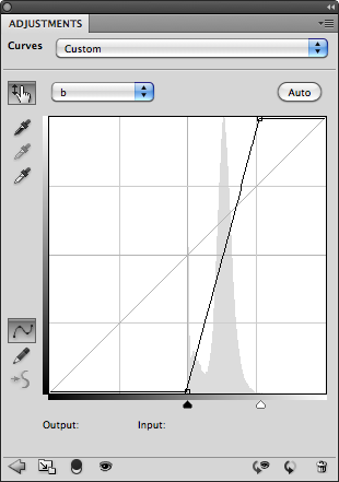
The Auto function has mapped the curve the color information in the image. As a result it is no longer symmetrical. In order for neutral colors to remain neutral, the curve must be symmetrical and pass through the origin at 0, 0. If we adjust the curves manually to look like this, we can restore neutrality…


The shadows no longer have a bluish cast, and if there were any white highlights, they would have remained white. But the separation between the reds and the greens is not nearly as dynamic.
But there is a way that we can have our cake and eat it too.
In this image at least, there are no neutrals grays, so we can “filter” the L*a*b* curve out of the highlights and shadows of the “auto” curve using the layer’s Blending Options.
1. Control or Right-click on the space next to the curve’s label to open up the layer’s Blending Options dialog…


…transformed from this…
If we had performed a similar adjustment in RGB under the best conditions (a contrast curve in Luminosity mode and Hue/Saturation in Color mode) this would have been the result…

I would describe this as largely monochromatic with little separation of color. This is important, because it’s exactly this type of image on which L*a*b* can truly work its magic. Without separation of color, tools like Selective Color cannot work effectively.
Normal images however can also benefit from L*a*b* processing. Take for example this photo of a little house, titled appropriately “Little House” in Boothbay Harbor, Maine:

It has a relatively normal balance of color, and so it’s histogram in the a and b channels is fairly centered about the origin, where neutrality occurs.


In this case, we can place a point in the center of the curve, and move it to the origin (0,0), which restores the original color balance, returning neutrality to the whites, grays and blacks. However, this creates an actual curve, which will accentuate some colors more than others, and which may not be desirable. If this is the case, we can place two additional points along the curve close to the origin to straighten it out…


And this is the end result:

Compared to the original…
Keep in mind that if you do perform this on a separate layer, you can brush the effect in, or use masking to make a local adjustment. With greater separation of colors, tools like Selective Color and Hue/Saturation work better. For example, the greens in this image are a little on the blue side for my taste, so I can use Hue/Saturation in the L*a*b* space to target the greens and tone them down a bit…

That’s better. I could also have used Selective Color on the RGB side, but unfortunately this adjustment layer is not available in the L*a*b* color space. However, it works to your advantage to make color adjustment in the L*a*b* space where possible, since its unlimited color gamut will produce better results.
Here are some other important things to know about the L*a*b* color space:
- You can freely convert back and forth between RGB and L*a*b* without any loss or change in color balance.
- Because luminosity and color are handled separately, it’s possible to create colors that cannot possibly exist in nature, such as a fully saturated white or black.
- When “impossible” colors are converted back to the RGB color space, colors are created that did not exist in the original image.
- By converting a small-gamut color space such as sRGB to a larger gamut space such as AdobeRGB or ProPhoto before applying L*a*b* color enhancement, it’s possible to restore some of the color vibrancy not captured when the image was taken.
Help for sRGB Images
The sRGB color space was designed to accommodate a large number to devices, and so it has a limited color gamut. This makes it difficult to use as a working color space and still obtain good results. But it’s even worse as a capture space, because it doesn’t give you all the colors in the original scene in the first place. L*a*b* can help to restore vibrancy to these images by producing colors that do not exist in the original capture, and converting them back to the destination space.
This photo was taken with a Canon PowerShot SD780 IS, which can only record images in the sRGB color space. The reds were stunning against the green background, rich and vivid. But when I viewed the image on my workstation, it came up short.

The reds were too magenta and saturated, and any attempt to sway them more toward yellow as they needed to be resulted in lost shape and washed-out color.
In the L*a*b* color space, I used Hue/Saturation to target the reds, slightly desaturate them, and add more yellow. This restored the shape and gave me the hue I visualized in the original scene. I then added an a/b curve to restore the saturation lost in the first step without compromising the shape. This also added vibrancy to the greens and the blue of the sky reflected in the water. This is the result:

It’s a subtle change, but much more faithful to the original image. Even though both of these images now exist in the sRGB color space, the enhancements, when converted from the unlimited gamut of L*a*b* to the limited gamut of sRBG, are very much present.
Saturday, November 26, 2011
Descreening an Image

When performing this process for printing, it’s assumed that you have permission to reproduce the image from its copyright holder. It may simply be a case where the original is lost or extremely difficult to obtain. The same conditions apply if you were to use the image as part of a photo composition, although copyright laws do allow images to be used without permission as long as they don’t exceed a certain percentage of the entire image.
That said, this tutorial explains how to convert the rosette pattern into a random pattern that resembles film grain with a minimal loss of detail.

Diffuse works by randomly moving pixels within each “sample”, which is exactly what we need to do to rearrange the rosette pattern to look irregular, similar to film grain. The trick is to find the optimum resolution at which to apply the filter to break up the pattern while preserving the detail.
We then apply Add Noise to enhance the effect of the Diffuse filter. Usually, 3% of uniform noise works well. Applying it as “Monochromatic” helps to keep down color noise.
To take the edge of the resulting “sharp” pixel texture, we then apply Gaussian Blur at a very low percentage, about 0.5%.
All of this results in texture similar to film grain. And since film grain is often perceived as noise, we can treat it as such and reduce it with Median, so this is the final filter we will apply. A radius of one pixel usually does the trick, as we don’t want to obscure too much detail.
Step by Step:
1. Begin with a pre-screened image (this is a crop of the original image at its orginal resolution.)

2. Assuming it was scanned at 100%, and that it has the typical line screen frequency of 133 lpi, resample the image to about 150% of its original size using Image > Image Size… (Command + Option + I). Some experimentation may be necessary to find the optimal resolution, but applying this effect to the original image often results in a substantial loss of detail.


And the resulting image like this…

If the image had been simply blurred enough to obscure the rosette pattern, it would have looked like this:

Moving Forward, you can now apply noise reduction to smooth out the grain if desired. Another trick is to increase the Median filter slightly (2 to 3 pixels is usually a good value) and apply Unsharp Mask to sharpen the image. The result may not be to your liking, but it is an option if the grain is distracting.

Subscribe to:
Posts (Atom)