
Applying a blend mode to an unmodified adjustment layer is the same as applying it to a merged pixel layer, except that it takes up far less disk space. In effect, this uses the image’s own pixel values to modify themselves, rather than using the defined amounts of the adjustment layers themselves. By using a Hue/Saturation layer as the basis of these adjustments, we can also achieve subtle control over the color balance, saturation and contrast of the exposure adjustment.
Lightening with Screen Mode
The Screen mode uses the pixel values in the layer to which it is applied to lighten those in the layers beneath. The effect becomes progressively stronger as the tonal values become darker. This makes it ideal for opening dark detail in heavy, “low key” images.
 |
| Boothay Harbor, ME Holga HL-N 60mm f/8; (90mm), 1/250 s @ f/8.0, ISO 200 |
 This image was taken with the Holga HL-N 60mm f/8 on a Nikon D90. A characteristic of this lens is dark, saturated, contrasty images with vignetted corners…just like the Holga 120 film camera. There’s much detail waiting to be revealed in the shadows, but we don’t want to use the usual vignetting remedy in Camera Raw or Photoshop, as this would only diminish the Holga effect. This image is perfect example of how Screen can be used to lighten a low key image.
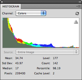
An image is low key when its histogram looks like the one to the right. The tonal information is lumped toward the dark (shadow) end of the histogram. The problem is, we need to open up the shadow detail, but we also need to maintain control over the contrast. Both of these goals can be accomplished with this adjustment technique, which favors the darker values of the image.
1. From the menu bar, choose Layer > New Adjustment Layer > Hue/Saturation.


 |

We’re not going to go crazy, just 5% or so to give us an edge. We now have lots of room to work with, but we need to re-establish the contrast.
 |

This is one of the most important dialogs in Photoshop. It’s one-stop shopping that allows you to modify many aspects of the adjustment layer including its blend mode.


 |
 |
Although the highlights are not technically washed out, they are very bright. If desired, we can also do a little “recovery” adjustment to smooth out the highlights…

 |
7. Now through all of this, the color may have suffered just a bit. Let’s bring up the saturation…
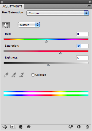
With “Master” selected, move the Saturation slider to the right. Next, we’ll take a little magenta down in the sky…

Sky generally falls in the cyan region, but in this image blues are most effective. Select the blues, and drag the Hue slider to the left. Finally, let’s clean up the grass…

Grass usually falls in the yellows, so we’ll select them and drag the Hue slider to the right to take down the magenta. Moving the Saturation slider to the right will clean them up a little further. And the end result…
 |
from the original…
|
- General “brightening“ (lightening with added saturation).
- Brightening already fully saturated colors.
- Reducing contrast.
- As the basis of a “Dodge layer”.
Darkening with Multiply
Like Screen, the multiply mode uses the pixel values in the layer to which it is applied to darken those in the layers beneath. The effect becomes progressively stronger as the tonal values become darker. This makes it ideal for adding shape and definition to thin, “high key” images.
 |
| Monhegan Island, Maine. Voigtländer Color Skopar 20mm f/3.5 SL II; 30mm, 1/1250 s -0.67 @ f/5.6, ISO 200. |

It’s difficult to identify this as a high-key image from its histogram, but you can clearly see the majority of the color activity concentrated at the right, or highlight end of the tonal spectrum.
uses the pixel values in the current layer to darken those in the layers beneath, with the effect becoming progressively stronger as the tonal values become darker. This makes it ideal for adding weight and definition to thin, flat, “high key” images.
1. From the menu bar, choose Layer > New Adjustment Layer > Hue/Saturation.
2. In the New Layer dialog, select Multiply from the Mode menu, and set the layer opacity to a nominal level. This time, I’m going to go straight to one of my “magic numbers’, 35%. Rename the layer “Multiply” if desired.

 |
3. But, what this image didn’t suffer from was a lack of contrast, and this has added more, We need that contrast in the lights, but not in the darks, so, we’ll adjust the Shadow “Blend If” slider accordingly…

Again, I go directly to that 127 point, the midtones. Now I can see that the sky is comprised of both clouds and blue sky, and through the theory of simultaneous contrast lightening the clouds should make the blues look richer. So I adjust the contrast in the lights with the highlight end of the “Blend If” slider…

What this means is that the adjustments we’re making are taking place between 127 (the mids) and 200 (the three quarter tones). It’s easy to convert 0-255 values to 0-100 values by divide one number by the other (200/255=.78). And the result…
 |
4. Much better. But there’s still something missing. The luminosity looks good, but the image still needs to be brighter. We’ve seen what happens when it’s lighter, so we know that’s not the solution. Lightness and Brightness are not necessarily the same thing. You can lighten an image up to a point, but beyond that point the colors begin to shift towards white, which is neutral color.
Normally, this would require a separate layer to restore the intensity of the colors, but we can do it all in the same layer with the Saturation slider…

And the result…
 |
from the original…
|
Normally, 50% is a pretty big adjustment for saturation. But the layer’s opacity is 35%, so we have plenty of headroom. If you wish to clean the colors without adding a lot of additional luminosity, you might keep the opacity low, and the saturation very high, perhaps 85%.
When used with the “Blend If“ sliders, Multiply is also great for…
- Recovering Highlights
- Adding contrast
- Adding richness to colors
- As the basis of a “Burn Layer”.
Exposure
This is a complex tool that’s designed for use with 32-bit HDR images, but works to some degree with 8-bit images as well. It behaves in a linear fashion like exposure within the camera, and is calibrated in f-stops, although its effects on highlights is severe. It also includes sliders for Offset and Gamma Correction to fine-tune HDR images. This advanced tool will be discussed further in a future tutorial on HDR Imaging.
No comments:
Post a Comment