
 If you want to enhance color, I mean really enhance color, L*a*b* is the way to do it.
The L*a*b* color space processes color in the same way the human eye does…separate from luminosity. Highly sensitive photoreceptors in the human eye called rods do not respond to color, while the less sensitive photoreceptors called cones do. The number of cones is only about 5% of the rods, but they come in three different types which respond to…you guessed it…red, green and blue wavelengths.
In low light, the rods enable us to see in the dark, at the expense of color perception. Under normal light, the cones take over to add the other dimension of vision: color. The three “axes” of color, red, green and blue, are gathered by the cones and processed by a secondary layer of the retina which converts these colors into two opposing-color channels, representing four axes of color: green/magenta and blue/yellow. It’s this color model after which the L*a*b* color space was conceived.
Because the L*a*b* color space separates Luminosity (L) from color (a, b) you can process color separately, maintaining the delicate tonal relationships. However, you can also change the lightness of the image without diminishing the color.
As you attempt to enhance color in an RGB image, you also affect the luminosity, which is encoded in each of the three color channels. In an L*a*b* image, you can process green and magenta (a channel) and blue and yellow (b channel) separately from the luminosity information (Lightness channel), and this capability can achieve some amazing results.
Take this image for example. It has some amazing colors, but they’re extremely muted:

In order to make this image come alive, we need to add contrast, and we need to separate the reds from the greens, and the greens from the yellows. We can process the color and contrast separately using curves in the L*a*b* color space.
The easiest and most convenient way to do this is in a single image file, using Smart Objects.
1. Open the image, select the background layer and duplicate it (Command+J)…

2. Convert the layer to a Smart Object…


4. Next, convert this image to the L*a*b* color space…


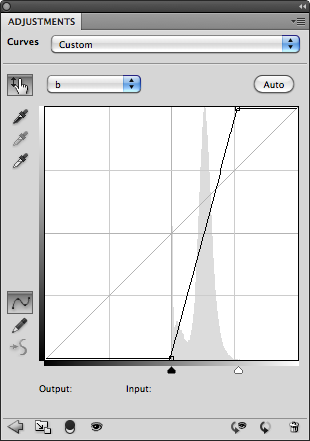
6. Now, let’s set up the Auto Options for curves. Click on the Adjustment Panel’s options menu icon…

7. Enter these shadow and highlight clipping values, check the “Save as defaults” box, and click OK.


In this case, I’ve set the 35% point back to 35, adjusting the gamma and reducing the washed-out effect. The resulting image looks like this:

9. Now comes the magic. Add a second curve as in Step 5, select the a channel, and click the Auto button. repeat for the b channel. You can rename this curve “Color” or “Saturation” if you wish.

What you wind up with is an image in which the absolute maximum amount of color separation has been extracted…

And when the Curve Layer’s opacity is adjusted to yield a more realistic level of color, say 35%…

…The image comes alive. Compare this with the image at the top of the page. You can now press Command+S to save the changes, and Command+W to close the .psb document window, returning you to the main window. The L*a*b* image is now embedded within the RGB image, and converted back to its space automatically. Be sure to also save the RGB image, or the changes will be lost.
Now, turn the L*a*b* layer’s visibility on and off to see the difference. You don’t have to duplicate the background layer to apply this effect, but we’ve done it here so you can easily see the difference L*a*b* curves have made.
Now, what we’ve done here is maximized the color separation between the greens and the magentas and the blues and the yellows. However, not all images have the same proportions of these colors, and the result of using this technique is that neutral colors will no longer be neutral. It’s not a major problem in this image, but it may be in others. Let’s go back to the a and b curves to see why.
The Auto function has mapped the curve the color information in the image. As a result it is no longer symmetrical. In order for neutral colors to remain neutral, the curve must be symmetrical and pass through the origin at 0, 0. If we adjust the curves manually to look like this, we can restore neutrality…


The shadows no longer have a bluish cast, and if there were any white highlights, they would have remained white. But the separation between the reds and the greens is not nearly as dynamic.
But there is a way that we can have our cake and eat it too.
In this image at least, there are no neutrals grays, so we can “filter” the L*a*b* curve out of the highlights and shadows of the “auto” curve using the layer’s Blending Options.
1. Control or Right-click on the space next to the curve’s label to open up the layer’s Blending Options dialog…


…transformed from this…
If we had performed a similar adjustment in RGB under the best conditions (a contrast curve in Luminosity mode and Hue/Saturation in Color mode) this would have been the result…

I would describe this as largely monochromatic with little separation of color. This is important, because it’s exactly this type of image on which L*a*b* can truly work its magic. Without separation of color, tools like Selective Color cannot work effectively.
Normal images however can also benefit from L*a*b* processing. Take for example this photo of a little house, titled appropriately “Little House” in Boothbay Harbor, Maine:

It has a relatively normal balance of color, and so it’s histogram in the a and b channels is fairly centered about the origin, where neutrality occurs.


In this case, we can place a point in the center of the curve, and move it to the origin (0,0), which restores the original color balance, returning neutrality to the whites, grays and blacks. However, this creates an actual curve, which will accentuate some colors more than others, and which may not be desirable. If this is the case, we can place two additional points along the curve close to the origin to straighten it out…


And this is the end result:

Compared to the original…
Keep in mind that if you do perform this on a separate layer, you can brush the effect in, or use masking to make a local adjustment. With greater separation of colors, tools like Selective Color and Hue/Saturation work better. For example, the greens in this image are a little on the blue side for my taste, so I can use Hue/Saturation in the L*a*b* space to target the greens and tone them down a bit…

That’s better. I could also have used Selective Color on the RGB side, but unfortunately this adjustment layer is not available in the L*a*b* color space. However, it works to your advantage to make color adjustment in the L*a*b* space where possible, since its unlimited color gamut will produce better results.
Here are some other important things to know about the L*a*b* color space:
- You can freely convert back and forth between RGB and L*a*b* without any loss or change in color balance.
- Because luminosity and color are handled separately, it’s possible to create colors that cannot possibly exist in nature, such as a fully saturated white or black.
- When “impossible” colors are converted back to the RGB color space, colors are created that did not exist in the original image.
- By converting a small-gamut color space such as sRGB to a larger gamut space such as AdobeRGB or ProPhoto before applying L*a*b* color enhancement, it’s possible to restore some of the color vibrancy not captured when the image was taken.
Help for sRGB Images
The sRGB color space was designed to accommodate a large number to devices, and so it has a limited color gamut. This makes it difficult to use as a working color space and still obtain good results. But it’s even worse as a capture space, because it doesn’t give you all the colors in the original scene in the first place. L*a*b* can help to restore vibrancy to these images by producing colors that do not exist in the original capture, and converting them back to the destination space.
This photo was taken with a Canon PowerShot SD780 IS, which can only record images in the sRGB color space. The reds were stunning against the green background, rich and vivid. But when I viewed the image on my workstation, it came up short.

The reds were too magenta and saturated, and any attempt to sway them more toward yellow as they needed to be resulted in lost shape and washed-out color.
In the L*a*b* color space, I used Hue/Saturation to target the reds, slightly desaturate them, and add more yellow. This restored the shape and gave me the hue I visualized in the original scene. I then added an a/b curve to restore the saturation lost in the first step without compromising the shape. This also added vibrancy to the greens and the blue of the sky reflected in the water. This is the result:

It’s a subtle change, but much more faithful to the original image. Even though both of these images now exist in the sRGB color space, the enhancements, when converted from the unlimited gamut of L*a*b* to the limited gamut of sRBG, are very much present.
No comments:
Post a Comment