 |
| AF-S Zoom-NIKKOR 70-300mm f/4.5-5.6G IF-ED + Kenko TelePlus MC7 900mm; 1/5 s @ f/11.0, ISO 800 |

News, Muse and Reviews for Aspiring Lensmen.
Wednesday, December 28, 2011
First Impressions: Kenko TelePlus MC7 AF 2.0X DGX Teleconverter
Wednesday, December 21, 2011
Dodging and Burning
This is a traditional darkroom technique used to selectively lighten and darken areas of a photograph during the enlarging process. A mask in the shape of the area to be lightened is attached to a thin wire and held in position just above the photo paper in the enlarger, so that it shadow prevents exposure. Slight movement softens the edge and prevents the wire from adversely affecting the exposure. This is known as “dodging”. Burning is the opposite effect, in which the area to be darkened is cut out of a larger paper mask to prevent exposure to other areas.
In digital retouching we use this effect on a daily basis to control local contrast in order to extend the apparent dynamic range of the photo. It’s a relatively simple process of selecting part of the image and applying an adjustment to alter its luminosity value. However for finer control, we can create adjustment layers that we can use to “brush in” the effect.
The many adjustment tools and blend modes in Photoshop can be used in many combinations to achieve advanced effects. For this tutorial however, we are going to concentrate on three techniques using The Overlay, Multiply and Screen modes.
Creating a Dodge & Burn Layer
For subtle adjustments, nondestructive dodging and burning can be performed in a single layer. For a more pronounced effect and to gain more control over color, we can use a separate layer each for dodging and burning as explained below.
1. From the menu bar, select Layer > New > Layer… or press Command + Shift + N.
2. In New Layer dialog, select Overlay from the mode menu and check the “Fill with Overlay-neutral color (50% gray)” box. Rename this layer “Dodge & Burn” if desired. Click OK.
3. Press D to set the background colors to their default black and white.
4. Press B to switch to the Brush tool.
5. In the Brush Options bar, set the opacity and flow to a low value, such as 10%.
6. Select an appropriate brush size and hardness.
7. Begin brushing in the document window to darken areas which are too light using black. To lighten dark areas, press X to exchange foreground and background colors in order to use white.
How it works
When the Overlay mode is applied to a layer, values in that layer that are lighter than 50% gray lighten the pixels of the layers beneath, while values which are darker than 50% gray darken them. This is also true of the Soft Light, Hard Light, Vivid Light, Linear Light and Hard Mix modes, which can also be used to achieve varying effects.
Creating a Burn Layer
When a stronger effect needs to be applied, and/or more control over color is desired, a separate burn layer can be created using the Multiply Mode.
1. From the menu bar, select Layer > New Adjustment Layer > Hue/Saturation…
2. In the New Layer dialog, select Multiply from the Mode menu; rename the layer “Burn” if desired.
3. With the layer still selected, fill the layer mask with black by selecting Edit > Fill… from the menu bar and select Black from the Use menu.
4. Press D to set the background colors to their default black and white.
5. Press B to switch to the Brush tool.
6. In the Brush Options bar, set the opacity and flow to a low value, such as 10%.
7. Select an appropriate brush size and hardness.
8. Begin brushing in the document window to darken areas which are too light using white. White is painted into the layer mask, revealing the effect of the Multiply blend mode.
9. To undo the effect, press X to switch to the background color (black) which then hides the effect of the Multiply mode.
10. To vary the overall intensity of the effect, adjust the layer’s Opacity slider
10. To vary the overall hue and saturation of the effect, adjust the respective sliders in the Hue/Saturation panel.
11. To darken the effect starting from the highlights, drag the Lightness slider to the left.
12. To lighten the effect starting from the shadows, drag the Lightness slider to the right.
How it Works
When the Multiply mode is applied to a layer, values in that layer darken those in the layers beneath, with the effect becoming progressively stronger as the tones become darker. This has the effect of darkening the image while adding contrast. Applying this mode to a non-modified adjustment layer is the same as duplicating the pixel layer itself, but takes up far less disk space. By using a Hue/Saturation layer, we have subtle control over the hue, saturation, shadows and highlights of the effect.
Creating a Dodge Layer
When a stronger effect needs to be applied, and/or more control over color is desired, a separate dodge layer can be created using the Screen Mode.
1. From the menu bar, select Layer > New Adjustment Layer > Hue/Saturation…
2. In the New Layer dialog, select Screen from the Mode menu; rename the layer “Dodge” if desired.
3. With the layer still selected, fill the layer mask with black by selecting Edit > Fill… from the menu bar and select Black from the Use menu.
4. Press D to set the background colors to their default black and white.
5. Press B to switch to the Brush tool.
6. In the Brush Options bar, set the opacity and flow to a low value, such as 10%.
7. Select an appropriate brush size and hardness.
8. Begin brushing in the document window to lighten areas which are too dark using white. White is painted into the layer mask, revealing the effect of the Screen blend mode.
9. To undo the effect, press X to switch to the background color (black) which then hides the effect of the Screen mode.
10. To vary the overall intensity of the effect, adjust the layer’s Opacity slider
10. To vary the overall hue and saturation of the effect, adjust the respective sliders in the Hue/Saturation panel.
11. To darken the effect starting from the highlights, drag the Lightness slider to the left.
12. To lighten the effect starting from the shadows, drag the Lightness slider to the right.
How it Works
When the Screen mode is applied to a layer, values in that layer lighten those in the layers beneath, with the effect becoming progressively stronger as the tones become darker. This has the effect of lightening the image while reducing contrast. Applying this mode to a non-modified adjustment layer is the same as duplicating the pixel layer itself, but takes up far less disk space. By using a Hue/Saturation layer, we have subtle control over the hue, saturation, shadows and highlights of the effect.
Tuesday, December 20, 2011
The Crop Factor
The crop factor is a number by which a lens’ focal length is multiplied to arrive at the equivalent focal length in 35mm film. Although popularized by the sub full-frame Digital SLR, its origins date back to the days of film and Kodak innovation.
In 1996, Kodak developed the Advanced Photo System (APS), a new film format with smaller film cartridges and a frame size of 25.1 x 16.7mm; about half the area of the full 36 x 24mm frame size of 35mm film. The smaller frame size had the same effect as “cropping” the width and height of the image by about 70%. In order to restore the familiar picture “angle” of 35mm film, lenses with a shorter focal length (and thus wider angle) must be employed.
For interchangeable lens cameras such as SLRs, this meant that using a normal 50mm lens would result in the equivalent picture angle of 71.5mm or 1.43x its focal length. This then is the crop factor for APS film cameras. In order to develop new lenses for these cameras, the reciprocal of the formula is used. So to design a “normal” 50mm focal length lens for an APS camera, the focal length must be 0.698x or approximately 34.9mm.
When digital SLRs became widely available in 1999, they employed sub full-frame sensors and so leveraged off the legacy of this new format. As a result, the APS format has become the new standard in Digital SLRs. APS-compatible lenses are smaller, lighter and less expensive than their full-frame counterparts, yet the APS system remains backwardly-compatible with full-frame “legacy” lenses. This is good news for users of telephoto lenses as their reach is increased by a factor of 1.5 times with no penalty of additional light loss.
APS lenses are designated with their actual focal lengths, not their APS “equivalent” focal lengths. This requires you to know to apply the crop factor to determine the picture angle of the lens when used with your particular body.
Nikon settled on a standard with a slightly smaller frame size than APS film frame, 23.6 x 15.7mm. This gives their cameras a 1.5x crop factor, a relatively easy number to work with. A 50mm normal lens therefore becomes 75mm. 35mm, the traditional length for photo reportage becomes “normal” at 52.5mm. A 24mm lens becomes the new wide angle standard at 36mm. A 300mm telephoto now become 450mm. Nikon calls this new standard “DX”, and in generic terms, it’s known as APS-C.
Canon settled on the slightly smaller frame size of 22.2 x 14.8mm for their APS-C format. This carries a crop factor of 1.6x, a little more difficult to work with, but still in the general ballpark. A 35mm lens on a Canon APS-C camera is therefore equivalent to 56mm. To complicate things further, Canon also has a second sub full-frame format known as APS-H, which carries a frame size of 28.7 x 19mm, or a crop factor of approximately 1.3x. A 35mm lens on a Canon APS-H camera now becomes 45.5, which is actually closer to the “true” normal focal length of 43.3mm.
Most other brands employ the 1.5x crop factor.
APS lenses have many advantages. In addition to the size, weight and cost advantage mentioned above, shorter focal length lenses have greater depth of field. So for any given focal length, there is a greater depth of field to work with than on a full-frame camera.
Here are some popular focal lengths and their APS-C, 1.5x equivalents:
The 1.5x crop factor results in legacy lenses having a longer, but still useful range. On the other hand, APS lenses will still mount on full-frame cameras, but because their “coverage” or projected image circle is smaller, the corners will be vignetted to varying degrees.
Nikon cameras have a special mode for this called “FX” crop, which uses a portion of the sensor to simulate the exposure on an APS-C camera, generating an image with a reduced resolution. However, even without this feature, the images can be cropped in post-processing.
Another approach is to crop the frame as a square composition:
This works particularly well if you prefer shooting in a square format. For example, the AF-S DX 16-85mm f3.5-5.6G works perfectly on a full-frame body and will capture excellent square format images at the extremely wide angle of 16mm.
Still another option would be to crop the photo to a panoramic format such as an aspect ratio of 9:6:
Nikon’s literature suggests that DX lenses cannot be used with 35mm film cameras. As you can see from the above images, this is not entirely true. When post-processed accordingly, they can produce rather nice images.
Compact digital cameras also have a crop factor, but it’s much higher due to their significantly reduced sensor size. However, it’s not essential to know as the lenses in these cameras are fixed. What is important however, is knowing the 35mm equivalent of each of its zoom steps, and this can usually be determined through metadata.
In 1996, Kodak developed the Advanced Photo System (APS), a new film format with smaller film cartridges and a frame size of 25.1 x 16.7mm; about half the area of the full 36 x 24mm frame size of 35mm film. The smaller frame size had the same effect as “cropping” the width and height of the image by about 70%. In order to restore the familiar picture “angle” of 35mm film, lenses with a shorter focal length (and thus wider angle) must be employed.
 |
| 1996 Nikon Pronea 600i, a full-featured APS film SLR with a 1.43x crop factor. |
 |
| 1999 Nikon D1, an APS digital SLR with a 1.5x crop factor. |
APS lenses are designated with their actual focal lengths, not their APS “equivalent” focal lengths. This requires you to know to apply the crop factor to determine the picture angle of the lens when used with your particular body.
Nikon settled on a standard with a slightly smaller frame size than APS film frame, 23.6 x 15.7mm. This gives their cameras a 1.5x crop factor, a relatively easy number to work with. A 50mm normal lens therefore becomes 75mm. 35mm, the traditional length for photo reportage becomes “normal” at 52.5mm. A 24mm lens becomes the new wide angle standard at 36mm. A 300mm telephoto now become 450mm. Nikon calls this new standard “DX”, and in generic terms, it’s known as APS-C.
Canon settled on the slightly smaller frame size of 22.2 x 14.8mm for their APS-C format. This carries a crop factor of 1.6x, a little more difficult to work with, but still in the general ballpark. A 35mm lens on a Canon APS-C camera is therefore equivalent to 56mm. To complicate things further, Canon also has a second sub full-frame format known as APS-H, which carries a frame size of 28.7 x 19mm, or a crop factor of approximately 1.3x. A 35mm lens on a Canon APS-H camera now becomes 45.5, which is actually closer to the “true” normal focal length of 43.3mm.
Most other brands employ the 1.5x crop factor.
APS lenses have many advantages. In addition to the size, weight and cost advantage mentioned above, shorter focal length lenses have greater depth of field. So for any given focal length, there is a greater depth of field to work with than on a full-frame camera.
Here are some popular focal lengths and their APS-C, 1.5x equivalents:
8mm = 12mm (full-frame fisheye)
16mm = 24mm (super wide angle)
20mm = 30mm (extra wide angle)
24mm = 36mm (standard wide angle)
28mm = 42mm (“true” normal)
35mm = 52.5mm (“standard” normal)
50mm = 75mm (portrait)
85mm = 127.5mm (portrait, short telephoto)
105mm = 157.5mm (moderate telephoto)
135mm = 202.5mm (standard telephoto)
200mm = 300mm (super telephoto)
300mm = 450mm (super telephoto)
500mm = 750mm (super telephoto)
The 1.5x crop factor results in legacy lenses having a longer, but still useful range. On the other hand, APS lenses will still mount on full-frame cameras, but because their “coverage” or projected image circle is smaller, the corners will be vignetted to varying degrees.
 |
| Nikon AF-S DX (APS-C) NIKKOR 35mm f/1.8G lens used on a full-frame camera body. |
 |
| The same image cropped to show how it would appear on an APS-C camera. |
 |
| The same image, cropped to a square format which eliminates the vignetting. |
Still another option would be to crop the photo to a panoramic format such as an aspect ratio of 9:6:
 |
| A “panoramic” crop with an aspect ratio of 9:6 will also reduce or eliminate vignetting. |
Compact digital cameras also have a crop factor, but it’s much higher due to their significantly reduced sensor size. However, it’s not essential to know as the lenses in these cameras are fixed. What is important however, is knowing the 35mm equivalent of each of its zoom steps, and this can usually be determined through metadata.
Monday, December 19, 2011
Adding Front Filter Threads to the Sigma EM-140 DG Macro Ring Flash
The adapter rings for the Sigma EM-140 DG do not have front filter threads. This means that you cannot add filters, or more importantly, close-up lenses in front of the flash. But with this trick, you can add them.
Reciprocity Failure
Beyond a certain length of exposure, film no longer absorts light in a linear fashion, requiring longer and longer times to achieve the equivalent exposure. This is known as reciprocity failure, and is important when working with long exposures, such as with pinhole cameras. Here’s a brief guide to some popular films and their reciprocity characteristics.
Sunday, December 18, 2011
Review: Voigtländer Color-Skopar 20mm f/3.5 SL II
I can never seem to stop looking for F-Mount pancake lenses, which are somewhat limited if you’re considering a Nikkor. There’s the 45mm f/2.8 P , the 45mm f/2.8 GN, the second-generation 50mm f/1.8, and the 50mm f/1.8 Series E, the craving for all of which has been satisfied by the Voigtländer Ultron 40mm f/2.0. It’s an outstanding lens.

But in a wider lens, the offerings are indeed few and far between. Although fairly compact, the Nikkor offerings simply don’t qualify as pancakes. So again I turn to Voigtländer, and again I am rewarded with a fine piece of glass.

The Color-Skopar is nearly identical to the Ultron, being only a few millimeters longer. In fact, from a distance it’s difficult to tell them apart. It has a very different image quality from the NIKKOR AF 20mm f/2.8D. For one, its considerably sharper in the corners at least in the DX format.
But for me the real joy is in its use. It simply feels great, and it transforms your DSLR picture taking into somewhat of a street-rangefinder experience. It’s light and compact, and allows you to preset the focus with its amazing depth of field.
Because it has an aperture ring, it’s also ideal for macro work when reversed. Simply attach a Nikon BR-2A Macro Reverse Ring to the 52mm filter threads, and a Nikon BR-6 Auto Diaphragm Adapter to the rear mount. You’ll have the ability to compose and meter at full aperture, and stop down to the taking aperture using the aperture lever provided. You can even do this remotely with a standard cable release.
Build Quality ★★★★★
This lens has a classic, pre-auto focus era build; all-metal construction, engraved paint-filled markings, rubberized focus ring grip, metal filter threads. At 6.9 oz (198g) it runs head to head with the AF-S DX NIKKOR 35mm f/1.8. The optical formula consists of nine elements in six groups, including one aspherical element. It’s aperture uses nine circular blades, which help to improve the bokeh, always an issue with wider lenses.
Compatibility ★★★★★
Although this lens has enough coverage for a full-frame sensor, its high degree of vignetting (-2.9EV at the borders) make it a more optimal lens for the APS-C “DX” format. The CPU chip means that it will meter on all post-1977 AI bodies, not just those that allow you to enter lens information manually. Its aperture ring assures compatibility with cameras that do not employ electronic aperture control. There are no dimples to attach a metering prong for non-AI conversion.
Focusing ★★★★★
Heavenly; smooth as silk and perfectly damped, with no play whatsoever. It’s enough to make traditionalists want to return to manual focus.
Optical Quality ★★★★
On a DX (APS-C) equipped DSLR, the image quality is very good, but truly excellent at f/8, where the optimum border and corner resolution converge with a center resolution ever-so-slightly softer than its f/5.6 peak. It exhibits excellent saturation and contrast characteristics, with a consistent if not razor-like sharpness from center to edge. On an FX equipped DSLR, the substantial vignetting might be an issue, and to a lesser degree its aberrations. However, its high degree of contrast tend to offset the additional chromatic aberration and coma outside the APS-C crop.
Value ★★★
This lens tends to be a bit pricey, but its value lies in its unique combination of small size and good image quality
Versatility ★★★★★
With an equivalent focal length of 30mm in APS-C, this lens turns your DSLR into a viable street camera, albeit not a very fast one. It allows you to get in close to your subject, which gives your images a pronounced sense of depth. In its native full-frame length of 20mm, it can capture breathtaking landscapes.
Diaphragm
9 curved blades
Filters
Accepts 52mm filters (if used on an APS-C camera, the 40mm Ultron’s domed hood can be used without vignetting, even with a filter attached).
Hood
An optional metal hood is available.
Included Accessories
Includes a 52mm pinch-style lens cap and rear cap.
Specifications


Selecting, Rating and Tagging Images
The first step of the post-processing workflow is to select the images you wish to keep, and to tag those that require further processing. This allows you to discard any outtakes or mishaps that take up valuable space on your workstation’s hard disk. You perform this task using Adobe Bridge, or the library viewer of other applications such as Aperture or Lightroom.
First, create a folder on your workstation or in your applications’s library to contain all the images offloaded from cameras and/or flash memory cards. Mine is named “Contact Sheet”, and contains subfolders for each of my cameras, even my film bodies which hold 35mm film scans.
As you add images to these folders, you review them from time to time and eliminate any completely wrong exposures, such as those first few images shot on the settings used from the previous session. Don’t actually delete them but “reject” them (tag them as “rejected”) if your application allows. This hides them from view, but allows them to remain in the folder. This way, if you to select and import all the images from the SD card (or other flash memory), to this folder, the application will “see” any duplicates and give you the opportunity to skip them. This ensures that you don’t leave any images behind. Once the card is reformatted, you can then delete the rejects.
Now comes the time to review the images. Rate any obvious keepers with five stars, workable images with three, and dogs with one, basing these decisions mostly on composition. Is the scale adequate? Are background elements interfering with the readability of the subject? Is it reasonably in focus?
Then, revisit these images and look at fine details such as focus and shadow/highlight detail. If two images are rated three, but on closer inspection one of them is sharper, upgrade it to a four. Of those fives, there may be some softer ones, so downgrade those to a four. The ones may be technically inferior, but they may have artistic potential, so uprate them accordingly. The background may be completely blown out, and the foreground way too dark, but this might make for an expressive silhouette.
Once you arrive at a final set of images, you can then tag them further with “keywords”, which will allow you to find them more easily in the future. You can now also tag them for further post-processing.
When the time comes to archive the images, this tagging process will enable you to quickly select and move them to their respective archive folders for burning onto optical media. The images tagged for further processing can then be moved to a separate folder until they are complete. Mine is named, “Lightbox”.
Dust and scratch removal often take a long time, distributed over several “sessions”. The working images (in “lossless” TIFF format so that subsequent savings don’t degrade image quality) remain in the Lightbox folder until they are complete, when they are saved as final JPEG copies. Aperture, Camera Raw, and Lightroom allow you to clone out spots in JPEG files using non-destructive algorithms, so you can leave them in this format to save space if you wish. Once complete you make a single duplicate JPEG copy with the changes in place, minimizing any image degradation.
Saturday, December 17, 2011
2012: A Good Year for Cameras
As 2012 approaches, more and more exceptional cameras are scheduled to debut, models that are sure to delight rangefinder fans. Here’s the short list:
Wednesday, December 7, 2011
First Impressions: Fujifilm X10
 |
| The Fujifilm X10; The Digital Rangefinder has Arrived. |
The packaging was not exactly the velour-lined variety you’d find in a Leica, but it was still definitely upscale (and environmentally friendly) nonetheless. The camera comes in a bag with a foil factory seal that cannot be removed and replaced without visible evidence.
This is a real camera; solid, metal; very little plastic is used. No detail has been overlooked to bring the rangefinder experience to a compact digital camera. Even Leica’s recent trend to omit their logo from the front of the camera for a clean appearance has been followed.
The first step with any camera, before you even power it on, is to install the neck strap. Fiddling with a new camera and dropping it on the floor is not a path to happiness. The X10 is a “real” camera in the sense that it has traditional lugs for the strap, just like you’d find on all classic cameras, and current “pro” models. I’ve always had a little trepidation about installing the split rings on these lugs, but Fujifilm has provided a small plastic tool to facilitate this operation without scratching either the lugs or the camera. Once the triangular-shaped split ring is on the lug, it’s a simple matter to insert a business card or similar thickness material between the ring and the lug as you rotate it around and into final position. The leather-like protector and strap go on easily from this point.
The size and weight of this camera are simply perfect, it being a tad smaller that an average rangefinder, which is a desirable thing. The viewfinder is left of center, making right-eye viewing, possible, which keeps your nose off the LCDand allows you to perform traditional both-eyes-open rangefinder composition. And its huge; about the same size as the Nikon D90, which is considerably larger than the Nikon D3100 DSLR.
At my first opportunity I pitted it against the Nikon D90 under the worst conditions; ISO 3200, f/2.8, 28mm. ISO 3200 is my benchmark for low-light performance. Anything beyond that I don’t expect much, even from cameras that are rated to ISO 25,600. I hope if I ever get my hands on a D800, I’m proven wrong. I had to stop down on the X10, because it’s one stop faster than the AF NIKKOR 20mm f/2.8D lens I’m using to test the Nikon (so technically I would have had to use only ISO 1600 anyway) and on the Nikon, I had to shoot at 30mm, the full-frame equivalent of the lens used.
Yes, the Nikon won. But, that win was very subjective. First, I had to focus manually, because the D90’s autofocus was inconsistent. The X10 nailed it first time. Second, the Nikon had so much contrast, that shadow detail was obscured in comparison with the Fujfilm. On the other hand, the X10 seemed a little flat. As far as sharpness, it’s kind of a draw; some areas of the X10 were sharper than the D90, and vice versa. The noise “grain” was very similar, although the X10’s was mottled; the D90’s was much cleaner.
But all in all the differences were not that great considering the size difference in the sensors:
 |
| Nikon D90 |
 |
| Fujifilm X10 |
 |
| Nikon P5100 |
At ISO 200 however, the differences become less. The P5100 holds its own, in many instances producing images that are just as sharp, or slight sharper. But, the caveat to that is that Nikon’s noise reduction renders images that have a somewhat pointillist, painterly quality, while the Fuji’s look much more natural and D90-like. Fuji’s images respond quite well to sharpening; Nikon’s do not.
 |
| Dedicated controls and a vast feature set put this camera in a whole new class. |
The X10 makes a bold departure from other cameras in its class by offering a mechanical zoom lens (vs. a motorized one) and an actual slip-on lens cap, as opposed to an integral shutter. The feature set is enormous. Everything I’ve been missing in my venerable Nikon P5100 is here, and more. Camera Raw, which can also be used on-demand with a dedicated button. Manual focus. White balance trim with Kelvin mode. Diopter viewfinder adjustment. Image preview. Lightning-fast response time. Low-light performance. The list goes on. Overall, it has much more in common with the D90 than it does with the P5100, and has officially displaced that camera as my backup. I will now officially dub my P5100 my “Digital Holga”. It still has much creative potential (just try finding a circular and full-frame fisheye lens for the X10). But it’s way out-classed by the X10, as are its successors, the P6000, 7000 and 7100.
There are a few gripes. Conspicuously missing was a cover for the hot shoe. I’ve never purchased a camera without one. I have a spare Nikon cover I can use, but that’s not the point. The battery life seems to be on short side. And then there’s the non-existent filter thread size issue. But if that’s the worst of it, I truly am in digital rangefinder nirvana
Sunday, December 4, 2011
Apple iPhone vs. Nikon Coolpix P5100
So, just for a quick comparison, I shot the same scene with my Nikon P5100 as I did with the iPhone 4S. Mind you, I had to set the exposure compensation on the P5100 to -2 stops to get the equivalent exposure:
The Nikon version is a little warmer, but the LEDs are the cool white type, and the white balance on the iPhone is much more accurate. Here’s the tight crop again…
If you consider just the normal exposure, the Nikon has just a little more resolution, but it’s also noisier and not as clean as the iPhone. But hands down, the iPhone HDR version is better than the Nikon. You can actually see the frame around the solar cell on the Muni Machine.
Also take into consideration that the iPhone’s field of view is wider, so the resolution should be less. Then take this into consideration…
The iPhone’s sensor is considerably smaller than the Nikon’s. If it were 12MP, it wouldn’t have performed as well as the Nikon’s, because the photosite density would have been just too much for its size. The area of the iPhone’s sensor is about 50% of the Nikon’s and its pixel count is about 66%, so they’re quite compatible in terms of photosite density.
 |
| Nikon Coolpix P5100; 1/8 s @ f/2.7, -2, ISO 800 (12MP) |
 |
| Apple iPhone 4S; 1/15 s @ f/2.4, ISO 800 (8MP) |
 |
| 300px x 200px crop, Nikon |
 |
| 300px x 200px crop, iPhone 4S |
Also take into consideration that the iPhone’s field of view is wider, so the resolution should be less. Then take this into consideration…
 |
| iPhone 4S sensor, actual size |
|
| Nikon P5100 sensor, actual size |
Friday, December 2, 2011
Baking and Photography
There are people who bake, and then there are Bakers. People who bake make cakes and pies, but Bakers make bread, and piecrusts. You know, the advanced stuff. The stuff that really separates the men and women from the boys and girls.
So it is with photography. People take pictures, but photographers make photographs.
So it is with photography. People take pictures, but photographers make photographs.
Thursday, December 1, 2011
51st Street, Early Morning
|
| 1/15 s @ f/2.4, ISO 800 |
The iPhone 4S’s HDR feature also works in dark situations. But they have to be very dark. Here you can see that it was able to better resolve the dark detail in this scene, compared with a standard capture…

This also results in a substantial increase in sharpness and detail as shown by this crop:
There are not exposure or ISO settings on the iPhone. You just tap in the area of the screen that you want to meter from and the camera goes into “area mode” a kind of spot meter mode. It seems to nail the exposure every time, not attempted to make a dark scene artificially bright. This is really how I visualized the scene at the time.

Wednesday, November 30, 2011

ATG Updates
I decided to rearrange things a bit. With the ongoing posting of Post-Processing tutorials, I decided to change the “Retouching” tab to “Tutorials” and include both Photography and Post-Processing. “Tips and Tricks” remains, and it now devoted exclusively to quick solutions and how to’s.
Monday, November 28, 2011
Color Enhancement with L*a*b* Curves
 If you want to enhance color, I mean really enhance color, L*a*b* is the way to do it.
The L*a*b* color space processes color in the same way the human eye does…separate from luminosity. Highly sensitive photoreceptors in the human eye called rods do not respond to color, while the less sensitive photoreceptors called cones do. The number of cones is only about 5% of the rods, but they come in three different types which respond to…you guessed it…red, green and blue wavelengths.
In low light, the rods enable us to see in the dark, at the expense of color perception. Under normal light, the cones take over to add the other dimension of vision: color. The three “axes” of color, red, green and blue, are gathered by the cones and processed by a secondary layer of the retina which converts these colors into two opposing-color channels, representing four axes of color: green/magenta and blue/yellow. It’s this color model after which the L*a*b* color space was conceived.
Because the L*a*b* color space separates Luminosity (L) from color (a, b) you can process color separately, maintaining the delicate tonal relationships. However, you can also change the lightness of the image without diminishing the color.
As you attempt to enhance color in an RGB image, you also affect the luminosity, which is encoded in each of the three color channels. In an L*a*b* image, you can process green and magenta (a channel) and blue and yellow (b channel) separately from the luminosity information (Lightness channel), and this capability can achieve some amazing results.
Take this image for example. It has some amazing colors, but they’re extremely muted:

In order to make this image come alive, we need to add contrast, and we need to separate the reds from the greens, and the greens from the yellows. We can process the color and contrast separately using curves in the L*a*b* color space.
The easiest and most convenient way to do this is in a single image file, using Smart Objects.
1. Open the image, select the background layer and duplicate it (Command+J)…

2. Convert the layer to a Smart Object…


4. Next, convert this image to the L*a*b* color space…


6. Now, let’s set up the Auto Options for curves. Click on the Adjustment Panel’s options menu icon…

7. Enter these shadow and highlight clipping values, check the “Save as defaults” box, and click OK.


In this case, I’ve set the 35% point back to 35, adjusting the gamma and reducing the washed-out effect. The resulting image looks like this:

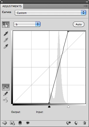
9. Now comes the magic. Add a second curve as in Step 5, select the a channel, and click the Auto button. repeat for the b channel. You can rename this curve “Color” or “Saturation” if you wish.

What you wind up with is an image in which the absolute maximum amount of color separation has been extracted…

And when the Curve Layer’s opacity is adjusted to yield a more realistic level of color, say 35%…

…The image comes alive. Compare this with the image at the top of the page. You can now press Command+S to save the changes, and Command+W to close the .psb document window, returning you to the main window. The L*a*b* image is now embedded within the RGB image, and converted back to its space automatically. Be sure to also save the RGB image, or the changes will be lost.
Now, turn the L*a*b* layer’s visibility on and off to see the difference. You don’t have to duplicate the background layer to apply this effect, but we’ve done it here so you can easily see the difference L*a*b* curves have made.
Now, what we’ve done here is maximized the color separation between the greens and the magentas and the blues and the yellows. However, not all images have the same proportions of these colors, and the result of using this technique is that neutral colors will no longer be neutral. It’s not a major problem in this image, but it may be in others. Let’s go back to the a and b curves to see why.
The Auto function has mapped the curve the color information in the image. As a result it is no longer symmetrical. In order for neutral colors to remain neutral, the curve must be symmetrical and pass through the origin at 0, 0. If we adjust the curves manually to look like this, we can restore neutrality…


The shadows no longer have a bluish cast, and if there were any white highlights, they would have remained white. But the separation between the reds and the greens is not nearly as dynamic.
But there is a way that we can have our cake and eat it too.
In this image at least, there are no neutrals grays, so we can “filter” the L*a*b* curve out of the highlights and shadows of the “auto” curve using the layer’s Blending Options.
1. Control or Right-click on the space next to the curve’s label to open up the layer’s Blending Options dialog…


…transformed from this…
If we had performed a similar adjustment in RGB under the best conditions (a contrast curve in Luminosity mode and Hue/Saturation in Color mode) this would have been the result…

I would describe this as largely monochromatic with little separation of color. This is important, because it’s exactly this type of image on which L*a*b* can truly work its magic. Without separation of color, tools like Selective Color cannot work effectively.
Normal images however can also benefit from L*a*b* processing. Take for example this photo of a little house, titled appropriately “Little House” in Boothbay Harbor, Maine:

It has a relatively normal balance of color, and so it’s histogram in the a and b channels is fairly centered about the origin, where neutrality occurs.


In this case, we can place a point in the center of the curve, and move it to the origin (0,0), which restores the original color balance, returning neutrality to the whites, grays and blacks. However, this creates an actual curve, which will accentuate some colors more than others, and which may not be desirable. If this is the case, we can place two additional points along the curve close to the origin to straighten it out…


And this is the end result:

Compared to the original…
Keep in mind that if you do perform this on a separate layer, you can brush the effect in, or use masking to make a local adjustment. With greater separation of colors, tools like Selective Color and Hue/Saturation work better. For example, the greens in this image are a little on the blue side for my taste, so I can use Hue/Saturation in the L*a*b* space to target the greens and tone them down a bit…

That’s better. I could also have used Selective Color on the RGB side, but unfortunately this adjustment layer is not available in the L*a*b* color space. However, it works to your advantage to make color adjustment in the L*a*b* space where possible, since its unlimited color gamut will produce better results.
Here are some other important things to know about the L*a*b* color space:
- You can freely convert back and forth between RGB and L*a*b* without any loss or change in color balance.
- Because luminosity and color are handled separately, it’s possible to create colors that cannot possibly exist in nature, such as a fully saturated white or black.
- When “impossible” colors are converted back to the RGB color space, colors are created that did not exist in the original image.
- By converting a small-gamut color space such as sRGB to a larger gamut space such as AdobeRGB or ProPhoto before applying L*a*b* color enhancement, it’s possible to restore some of the color vibrancy not captured when the image was taken.
Help for sRGB Images
The sRGB color space was designed to accommodate a large number to devices, and so it has a limited color gamut. This makes it difficult to use as a working color space and still obtain good results. But it’s even worse as a capture space, because it doesn’t give you all the colors in the original scene in the first place. L*a*b* can help to restore vibrancy to these images by producing colors that do not exist in the original capture, and converting them back to the destination space.
This photo was taken with a Canon PowerShot SD780 IS, which can only record images in the sRGB color space. The reds were stunning against the green background, rich and vivid. But when I viewed the image on my workstation, it came up short.

The reds were too magenta and saturated, and any attempt to sway them more toward yellow as they needed to be resulted in lost shape and washed-out color.
In the L*a*b* color space, I used Hue/Saturation to target the reds, slightly desaturate them, and add more yellow. This restored the shape and gave me the hue I visualized in the original scene. I then added an a/b curve to restore the saturation lost in the first step without compromising the shape. This also added vibrancy to the greens and the blue of the sky reflected in the water. This is the result:

It’s a subtle change, but much more faithful to the original image. Even though both of these images now exist in the sRGB color space, the enhancements, when converted from the unlimited gamut of L*a*b* to the limited gamut of sRBG, are very much present.
Subscribe to:
Comments (Atom)